Behind the Scenes of a Webpage
Overview
Cloudflare Radar · URL Scanner
The Cloudflare Radar URL Scanner generates a report of a URL with a breadth of technical details such as page performance data, DNS records, and what libraries/technologies the page is using. It was released during Security Week in March of 2023.
Belonging to the Emerging Technologies and Incubation group at Cloudflare, the development process of Radar highly prioritised speed-to-market above all else. This was the definition of a "fast-paced environment" — quickly producing development ready specs, clearly outlining any risks or assumptions, and making UX decisions based off of best practice.
- Web Browser
- Analyze any URL safely using the Cloudflare Radar URL Scanner
- Product Manager
- Engineering Manager
- Product Designer
- Systems Engineers x 2
Conducting a landscape analysis
Learn from what already exists.
Broadly speaking, the purpose of this feature was to essentially allow a user to be able to submit a URL and view particular characteristics about it. With that in mind, I spent some time learning about existing services, both similar (such as URLScan), and others somewhat indirectly related (such as SerpAPI). Throughout my research, I had two objectives:
- Understand what user expectations are for this feature, based on current market standards
- Identify any areas of opportunity to differentiate (e.g. is something too complex or is there an expressed user need which isn’t being met)
Oftentimes with SaaS products, it can be difficult to get access to the actual product themselves. Therefore I try to augment my research by including other sources such as product overview videos, social media posts, and user generated reviews.
Make it easy to submit a new URL
It won't be used if it can't be found.
The IA lacked any existing areas to place this new feature.
Conducted an audit of similar features, exploring how a new section could be added to increase the usage of each.
Over time, the Radar app had accrued multiple other features which didn’t quite fit into the prevalent “presenting data in a dashboard” layout. I used this as an opportunity to explore some options with regards to updating the information architecture.
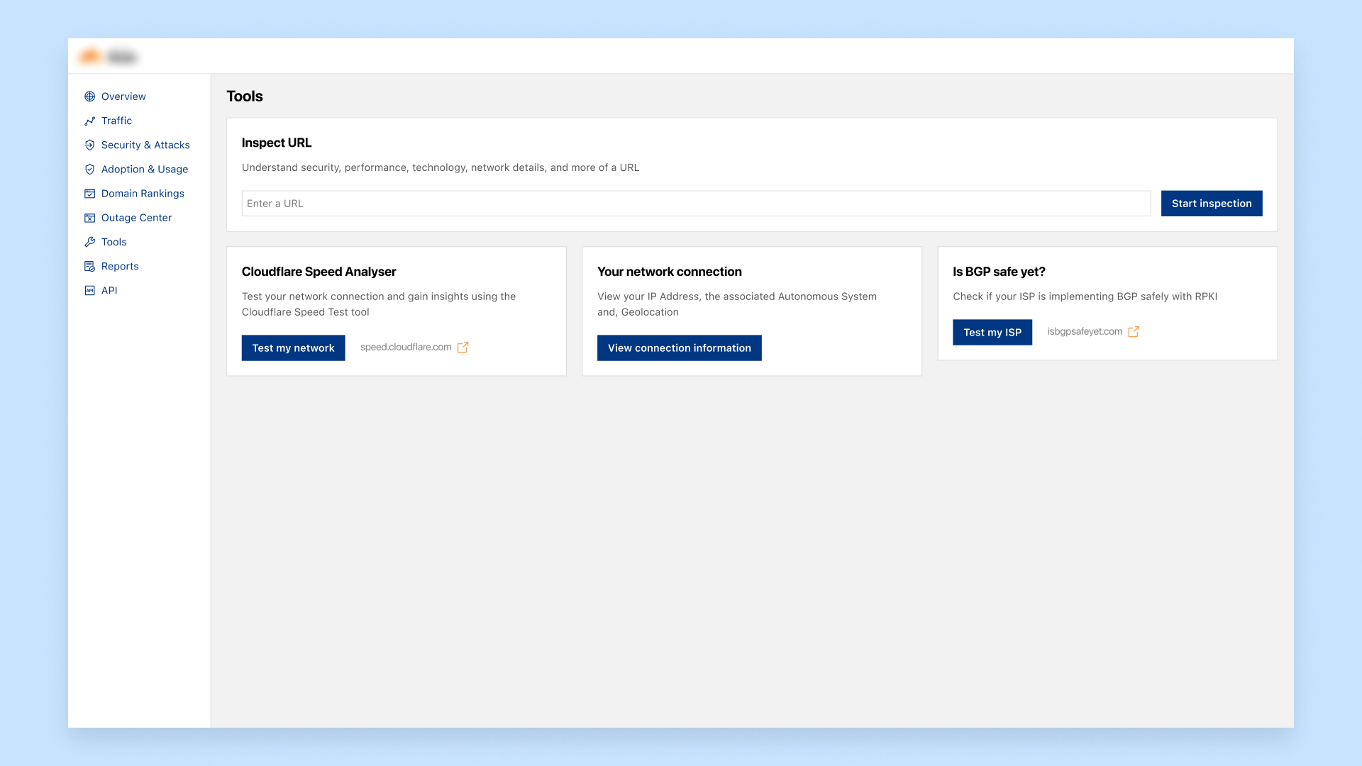
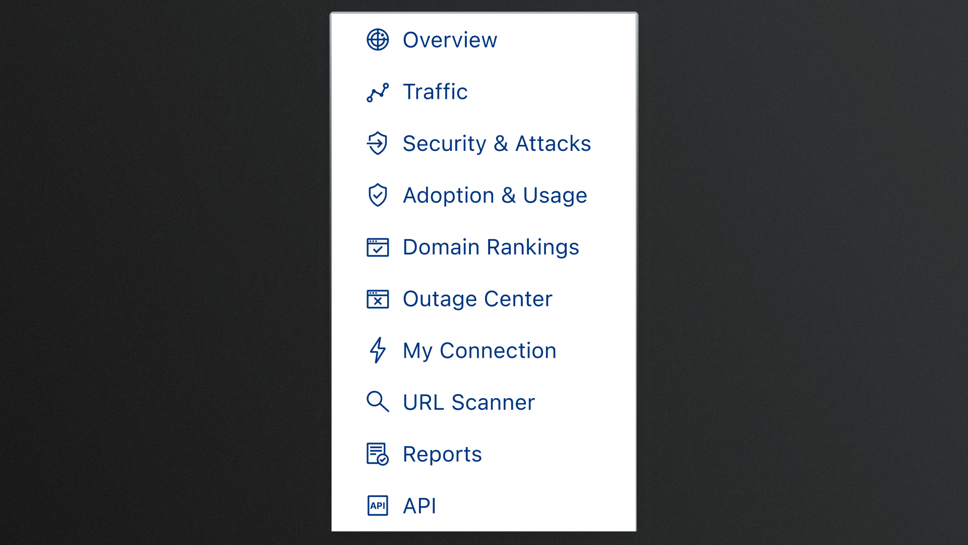
For the initial release, the team agreed that changing the IA at the same time as introducing a new feature to the platform could be too much change at once; therefore the URL Scanner feature was added as a new item within the sidebar navigation.
Help the user understand the capabilities
Offer a fast path to value.
With limited time, we couldn't create a dedicated onboarding experience.
Provided an intuitive affordance highlighting previously scanned URLs, creating a path for users who didn't have a URL at hand to scan, allowing them to experience the product and see first hand what was included.
As this was a new feature within the platform, I wanted users to be able to quickly understand what could be achieved. Traditional approaches to such a need could be to include a series of “onboarding” instructions often presented as a carousel or "spotlighting" different UI elements. However, I often find that this approach can be distracting to the users goal, and a speed-bump for those who are aware of what the feature does.
Instead, I wanted to achieve two points from this page:
- Provide a clear path to proceed for those who have a URL they want to scan
- Provide a path forward for users who are either exploring Radar, are unsure of what is included in the output from a scan, or haven’t got a URL to scan
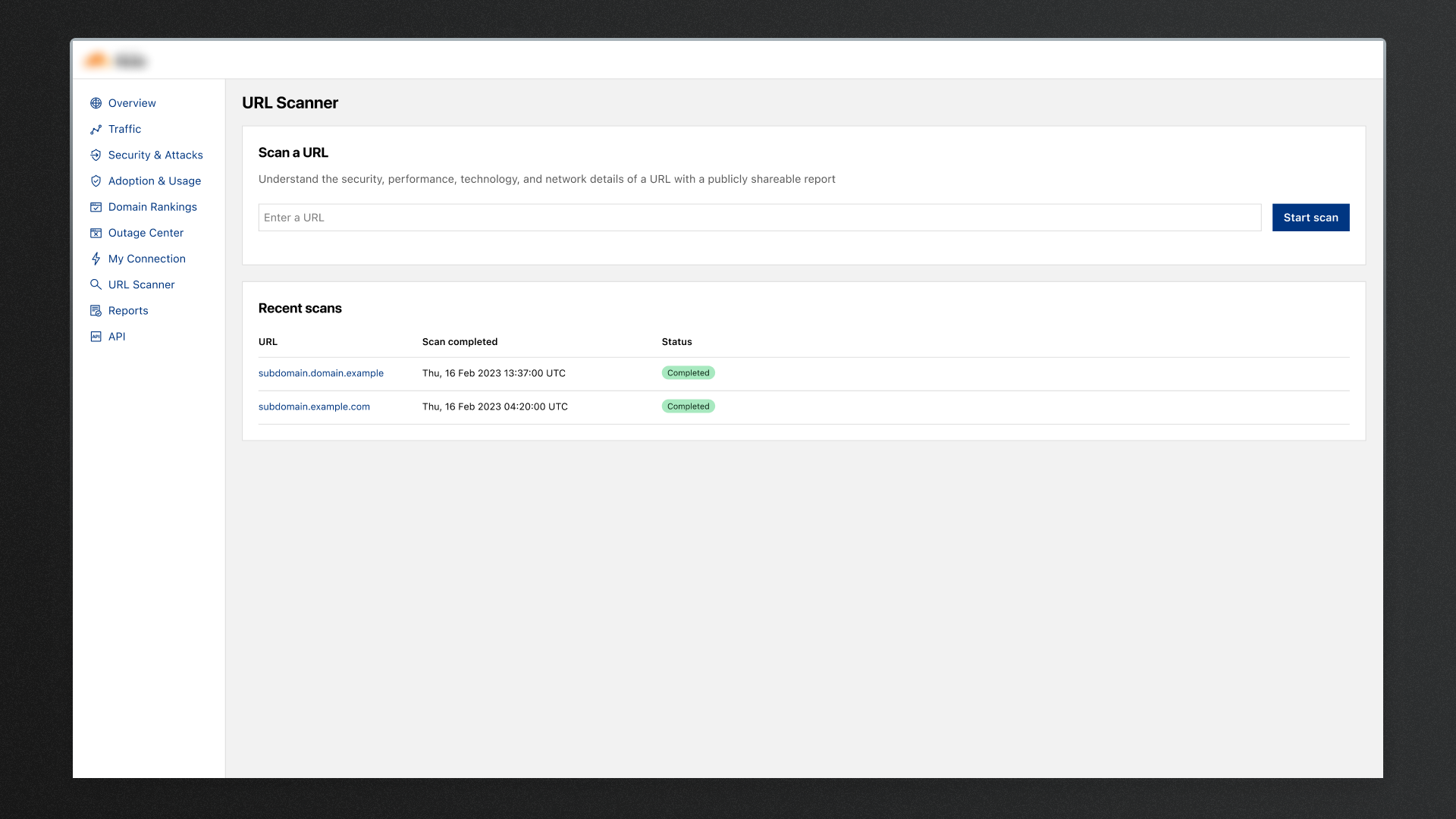
Point number two is what led to the inclusion of the “Recent Scans” table. This now allows a user to view the results of a scan without having to wait for one to be completed. As an additional benefit, the inclusion of the table beneath the URL submission table provides a signal to users submitting a URL that their submission will also be made visible to others. This particular point was brought up during conversations with cross-functional stakeholders who had concerns that users might have the false assumption that the results of their submissions would only be visible to themselves.
Highlight information in chunks
It should be easy to glance.
With a myriad of information available to display, there was a risk of quickly overwhelming the user, potentially causing them to abandon the entire feature.
Explored multiple UI patterns, specifically single page and tabbed navigation to understand and really visualise the content.
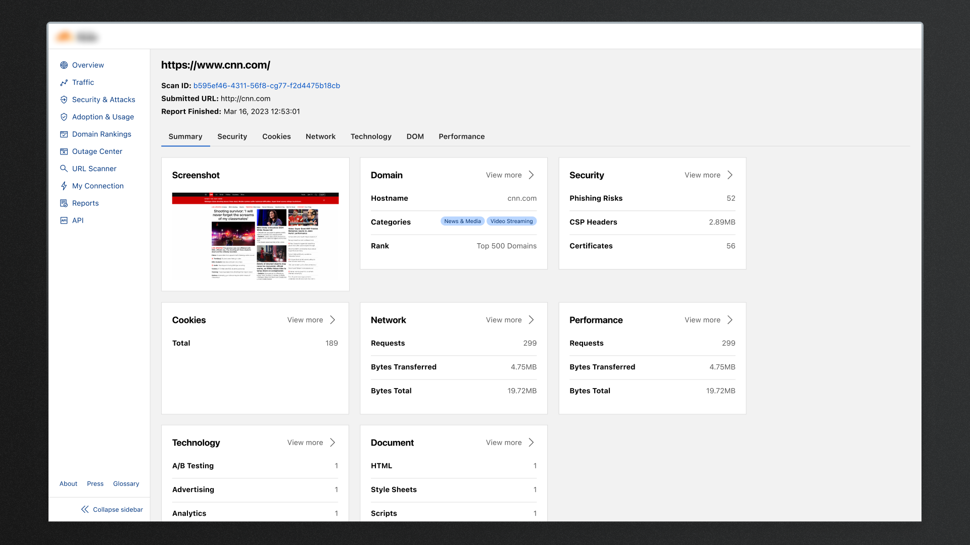
It was determined that the URL Scanner should return information about the submitted URL relating to the anatomy of a webpage. These categories could be summarised as:
- Security — General security risks and information relating to certificates
- Cookies — A list of any cookies that the page uses
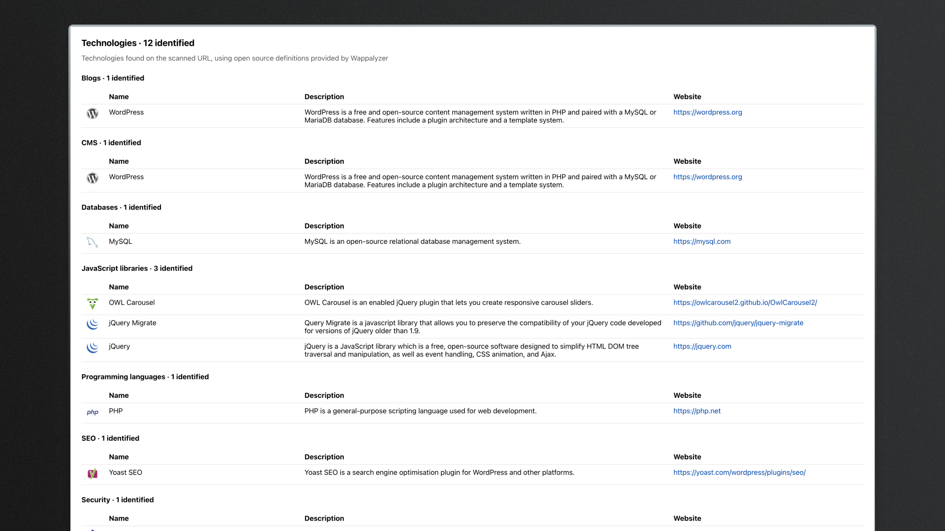
- Technology — Enumerating the various identified technologies used
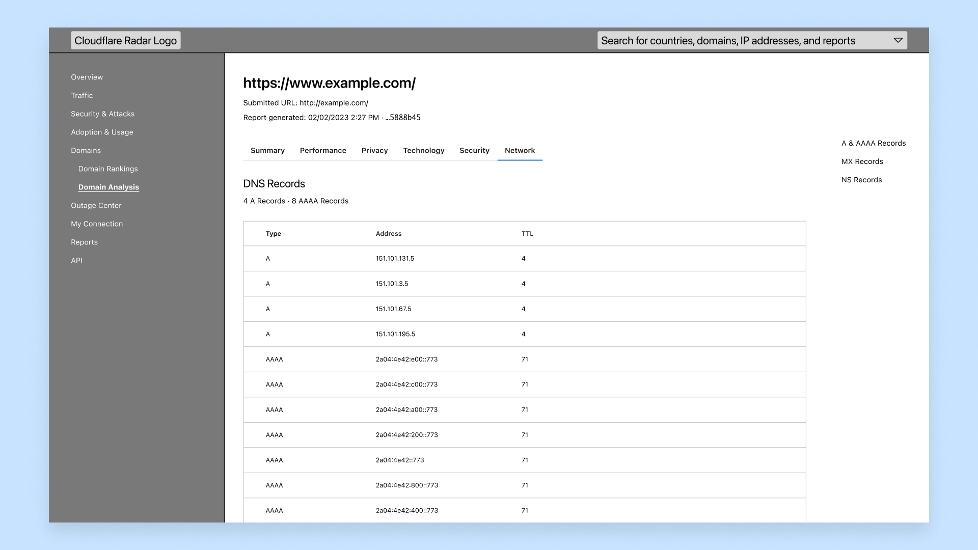
- Network — The HTTP Transactions and DNS records
- DOM — Any links, JavaScript variables, Console Log messages, and the raw parsed HTML
- Performance — Various figures relating to Performance Navigation Timing
During early concepts, I explored the idea of having a single page to display the information. Doing so would enable the user to utilise browser search functionally to search the page for a specific piece of text. However, I quickly realised when including longer content such as the results of the Performance Navigation Timing, the page would become overwhelmingly long.
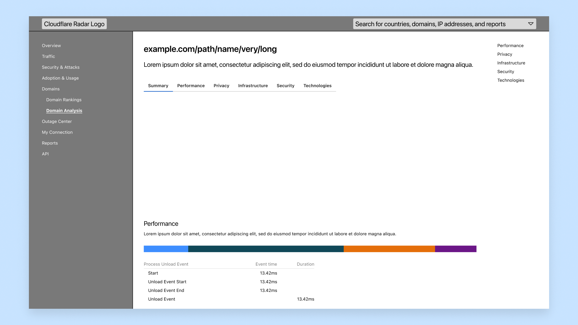
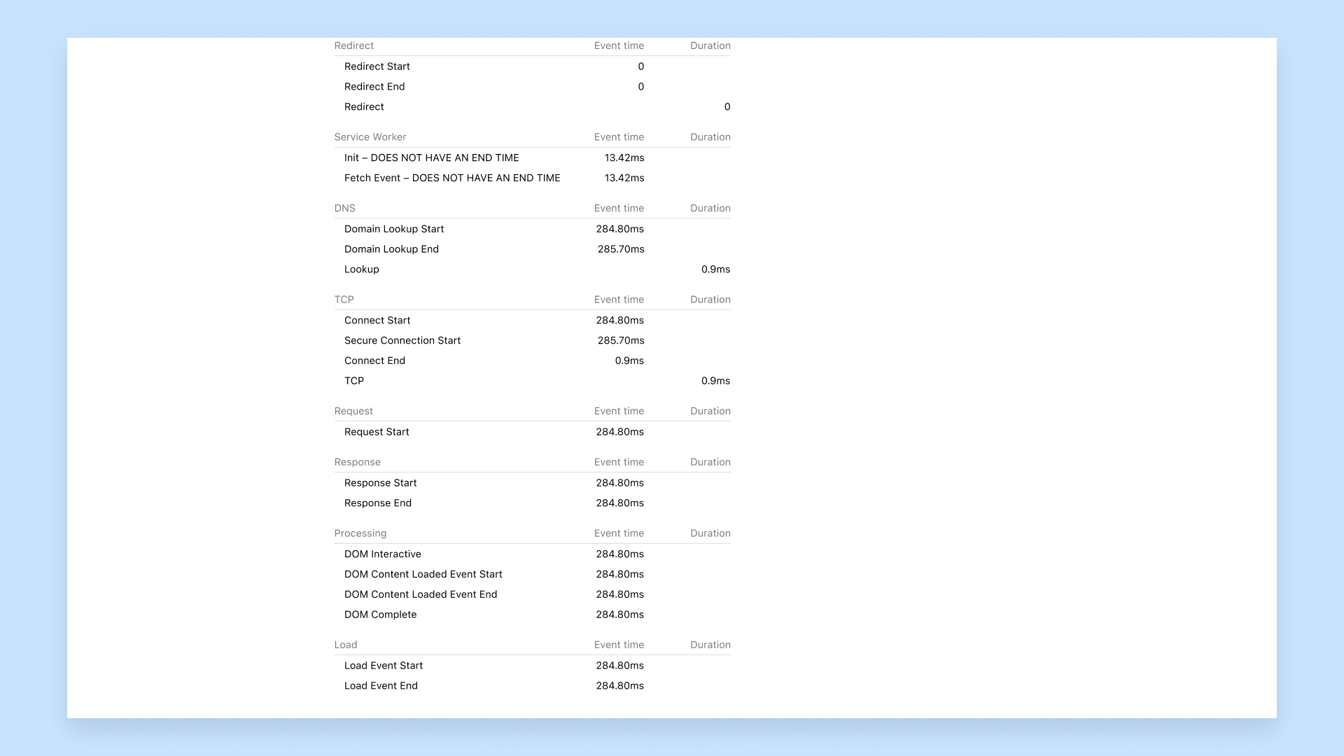

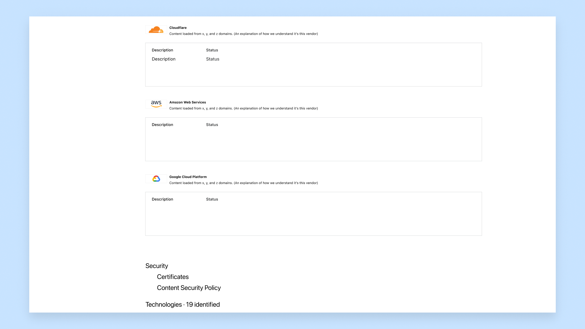
In subsequent concepts, I decided rather than presenting all of the information on a single page, instead create logical groups and utilise a horizontal tab bar. Doing so, I was able to strike a balance between the page being information-dense and simple to navigate.
Once a scan has been successfully completed, a summary is presented including a screenshot of the scanned page, and individual cards for each group. From here, the user is able to click through to the dedicated sections to get further insights. It’s this style of organising and presenting information which resonates with myself the best — share an overview, and as the user has displayed intent to engage further with the app, present more detailed and contextual information along that journey.
Final designs
Scannable yet information dense.
Users are able to intuitively submit their own URL to scan or alternatively can view previously submitted URLs, all whilst adhearing to the Design System specific to Radar.


Ongoing updates
There's always more to come…
Inability to display screenshots from devices other than desktop — leaving users unable to compare differences between breakpoints.
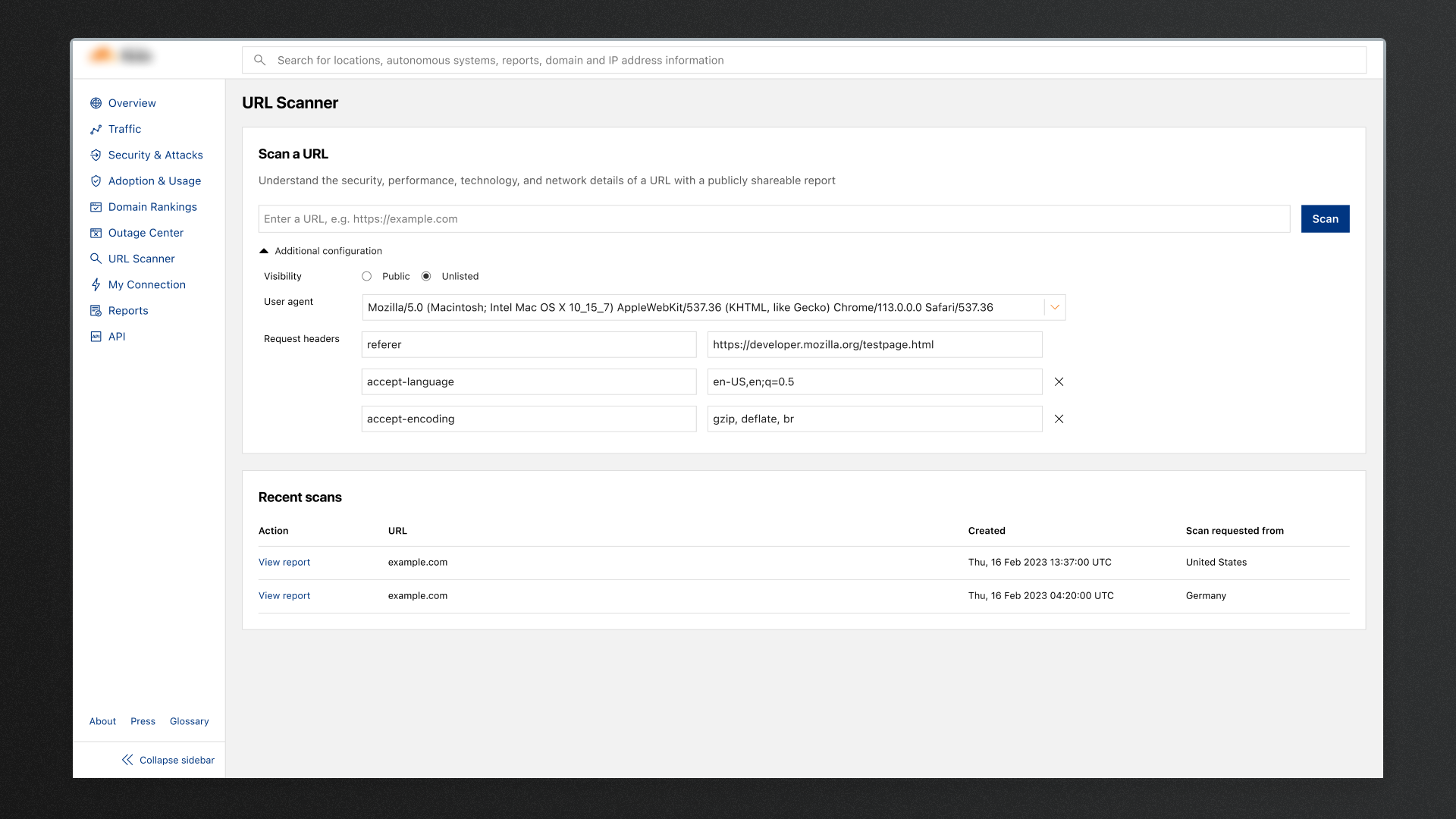
Inability to hide scans from the recent scans table, causing some users to avoid using the feature.
Inability to supply specific HTTP headers which could allow for different responses depending on the header.
Working with Product and Engineering, we prioritised "quick fixes" which were essentially aspects of the feature which were cut from the original release due to time constraints. These by and large addressed a lot of the initial feedback we received from users.
This feature was released during Cloudflare Security Week 2023 in March of 2023. The feature wasn’t initially included as part of the product roadmap, but was shipped nonetheless. That said, there were some areas we knew we could improve.
It’s important to note here that the Cloudflare Product Development philosophy is to release a working version of the feature, meeting initial outlined user needs as early as possible. Waiting until the “perfect” version has been created simply means that we spent too much time during feature development. We want to get the product into the hands of our customers as quickly as possible, enabling us to get their feedback early and iterate further from there.
During my time at Cloudflare, understanding that this was how the company operated, I would work with Product Managers to help them incorporate improvements to existing features alongside any new features queued for development within the next development cycle.
