Actionable Insights
Overview
Cloudflare Security Center · Actionable Insights
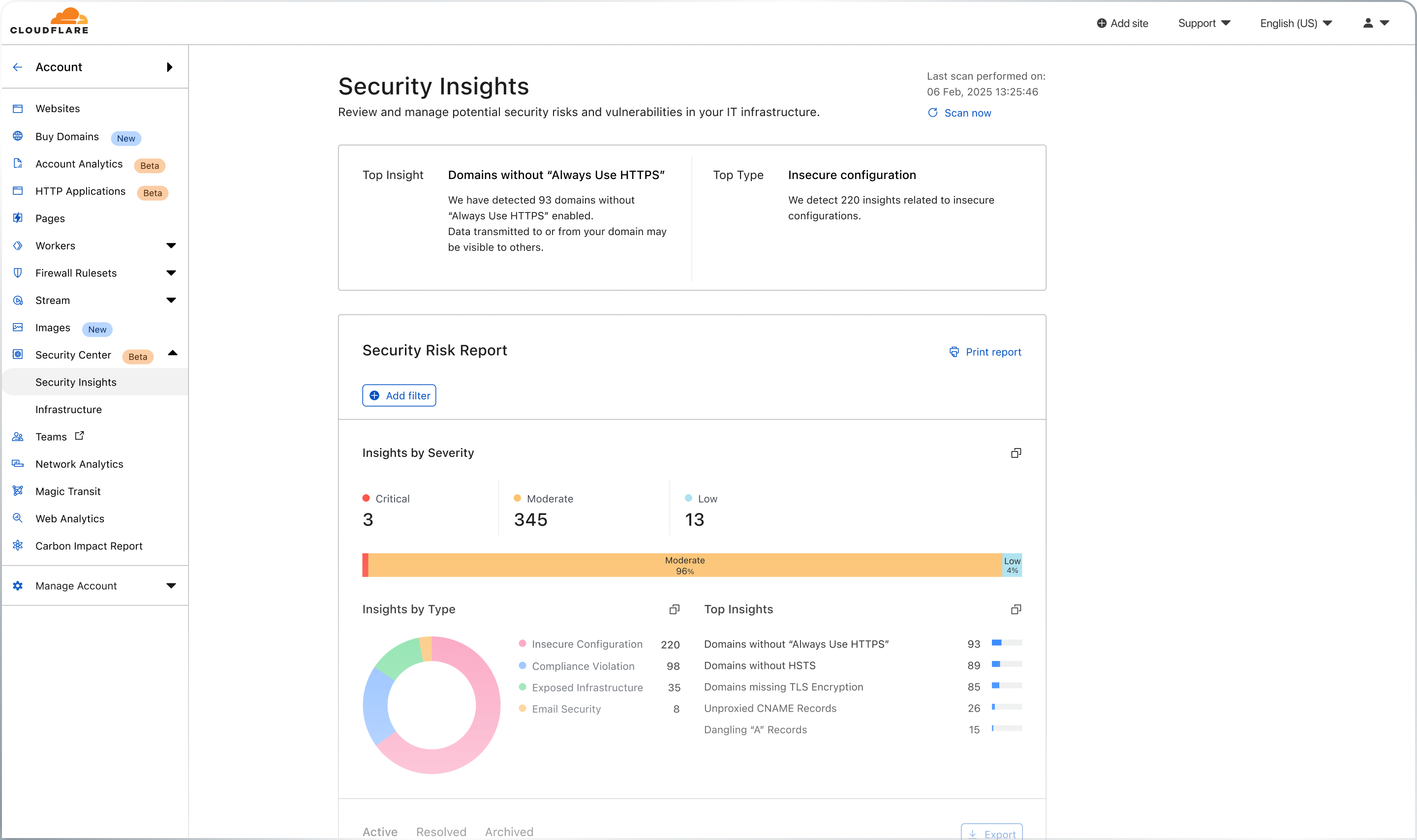
The Cloudflare Security Center is a single place to view the overall security posture of a corporation. Users can map attack surface areas, review potential security risks and threats, and quickly and simply mitigate these risks with a single click. It was released in December 2021.
Belonging to the Emerging Technologies and Incubation group at Cloudflare, the development process of Radar highly prioritised speed-to-market above all else. This was the definition of a "fast-paced environment" — quickly producing development ready specs, clearly outlining any risks or assumptions, and making UX decisions based off of best practice.
- Web Browser
- Introducing Cloudflare Security Center
- Product Manager
- Engineering Manager
- Product Designer
- Systems Engineer x 4
Gathering inputs, reactions, and feedback from customers
Using familiar formats to seek feedback.
Receiving support from User Research was challenging due to their limited availability.
Working with the Product Manager, I produced slides which could be shared during customer calls to validate the information we wanted to include and use it as an aid to learn about what else customers wanted to see.
With many customers, from different industries using Cloudflare, it was important to be able to speak with a diverse set amongst this range. Importantly, this would allow us to prioritise their common needs.
We wanted to get the reaction from customers about specific information that was under consideration to include for the feature. The task here was the validate the information, not how it was being displayed, nor any of the associated interactions. As such, rather than potentially distract the customers during the conversation with UI, we instead shared specific, detailed figures, similar to that which we would be able to share within the product, in a presentation/Slides format. The report generated for each customer highlighted various discovered vulnerabilities within their infrastructure.
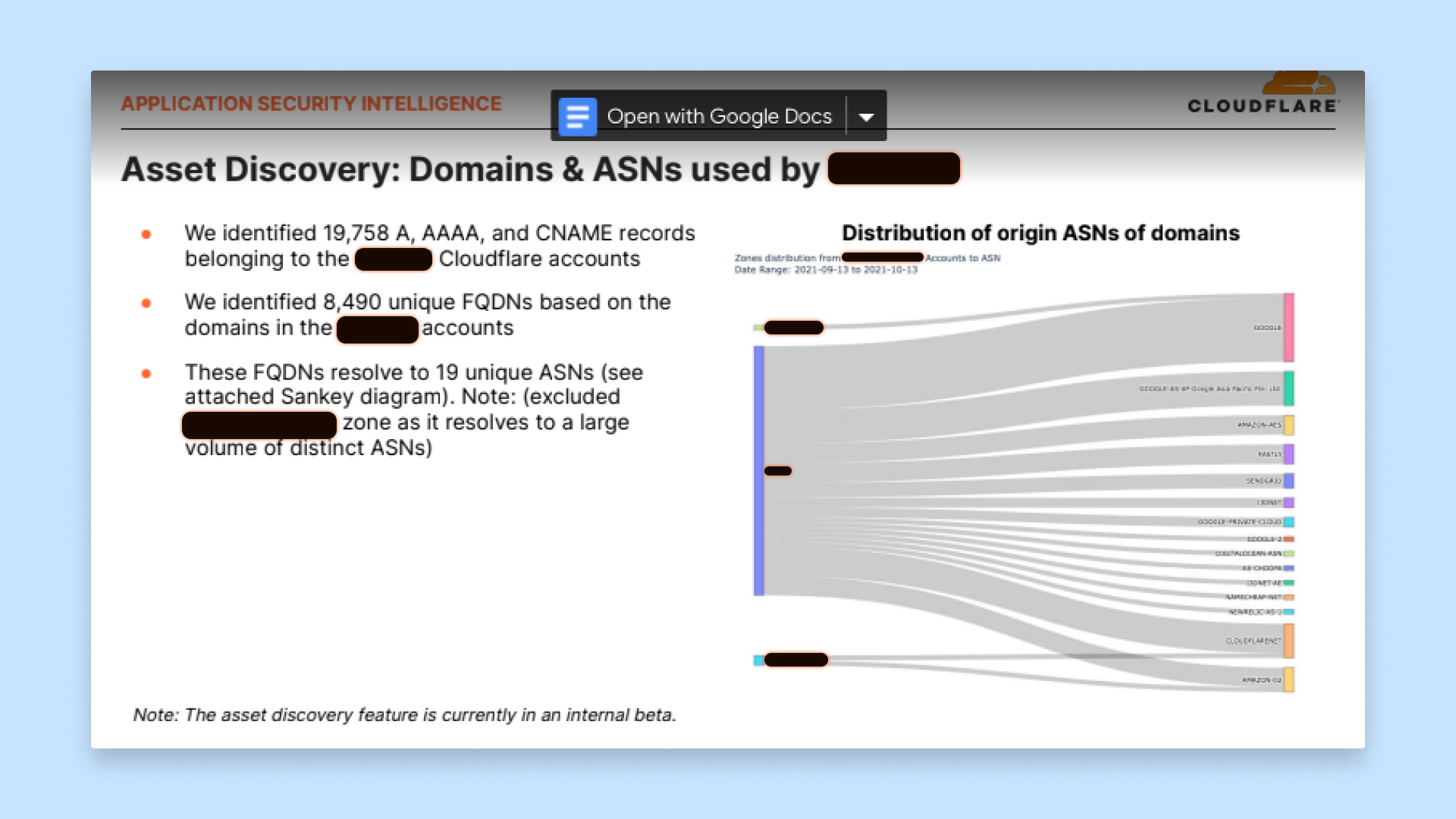
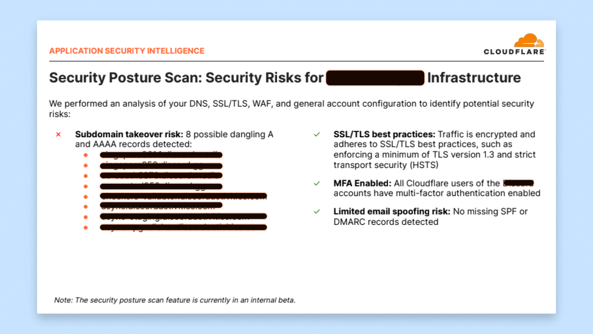
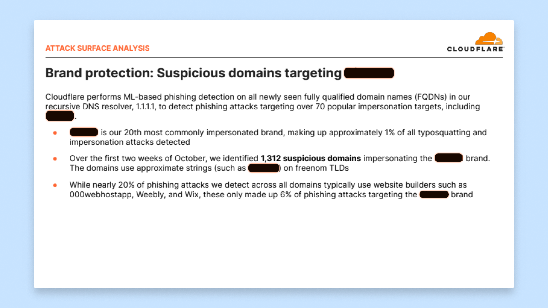
Working with our partners within Sales and Customer Success, we spent a portion of time during scheduled calls with customers to get their feedback. We were able to hear directly, that a) the problem is indeed valid and a concern they have and b) how they're struggling to solve for this problem themselves, having to rely on complex, suboptimal solutions.
The use of the presentation/Slides format proved to be critical part of capturing feedback from customers. The familiarity of the tool meant that we weren't spending any time being distacted and instead could focus totally on the information we wanted to validate. For example, we were able to quickly update phrases/terminology between conversations to see which resonated better.
We used these conversation with customers as an opportunity to validate what they would like to see, how they would use that information, and why they wanted to see it.
Whiteboarding
Consolidate learnings and define the problems.
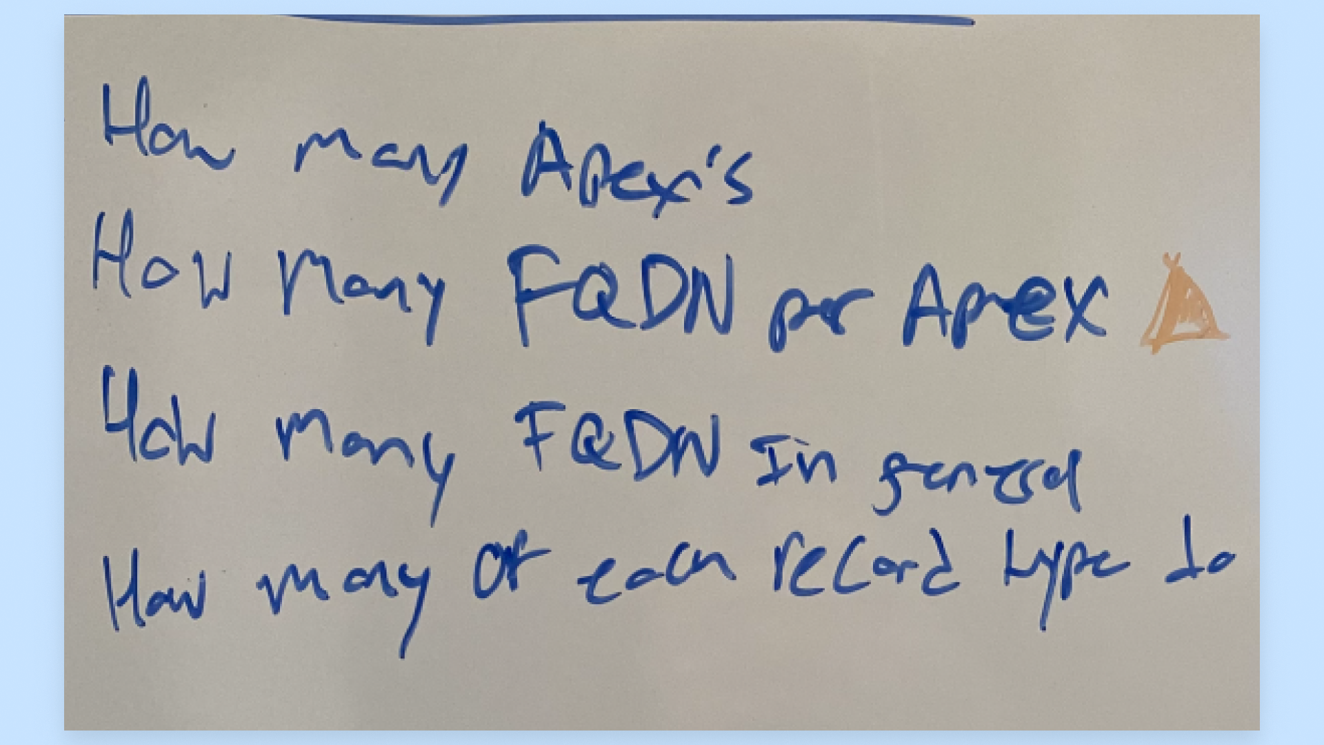
With the insights I had gained from the conversations with customer, myself and the Product Manager spent time together conceptualizing. This process involved mapping out the relationship between different pieces of information, considering data visualisations, and noting any areas which would require further validation from either customers or our engineering partners.
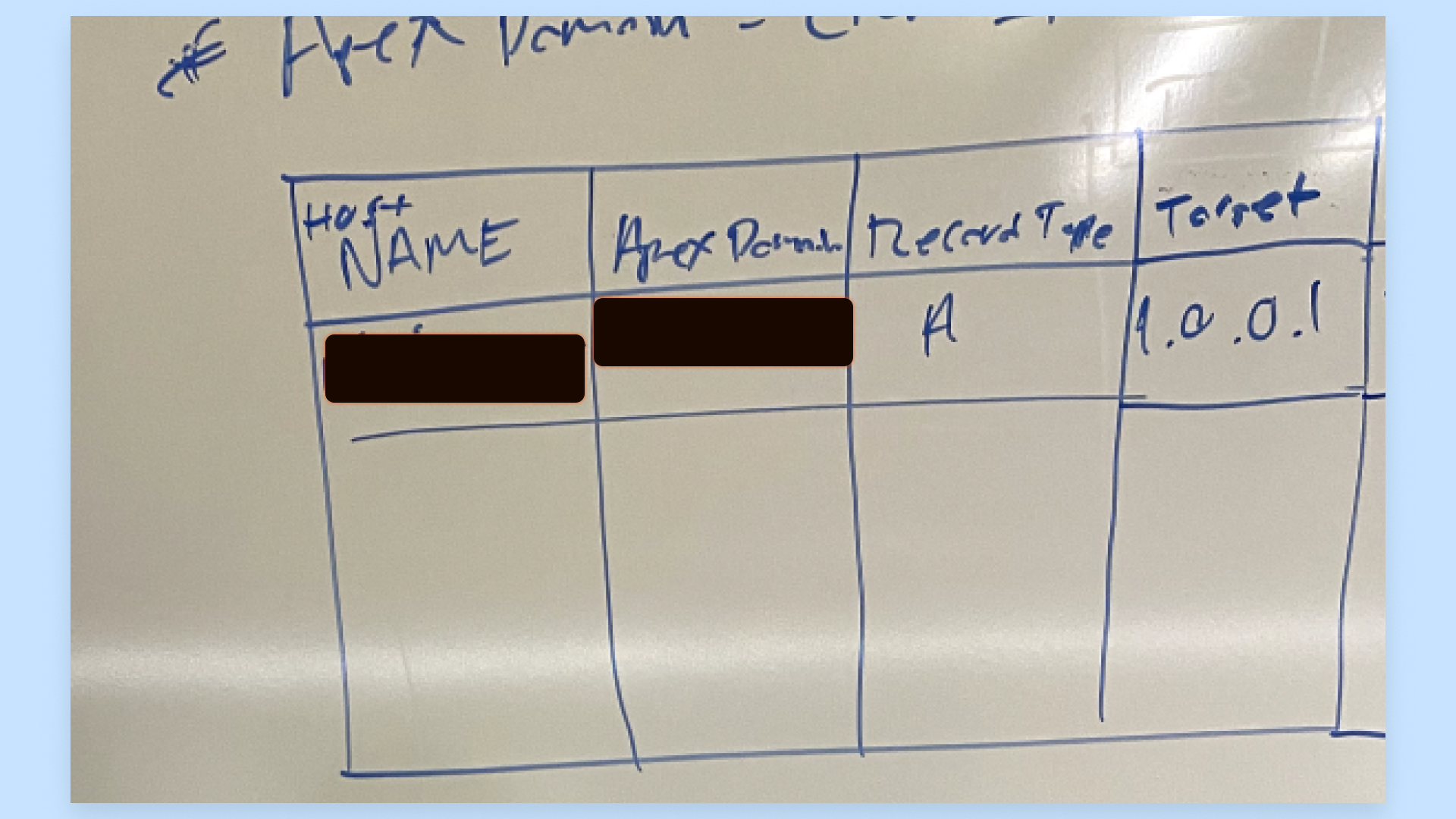
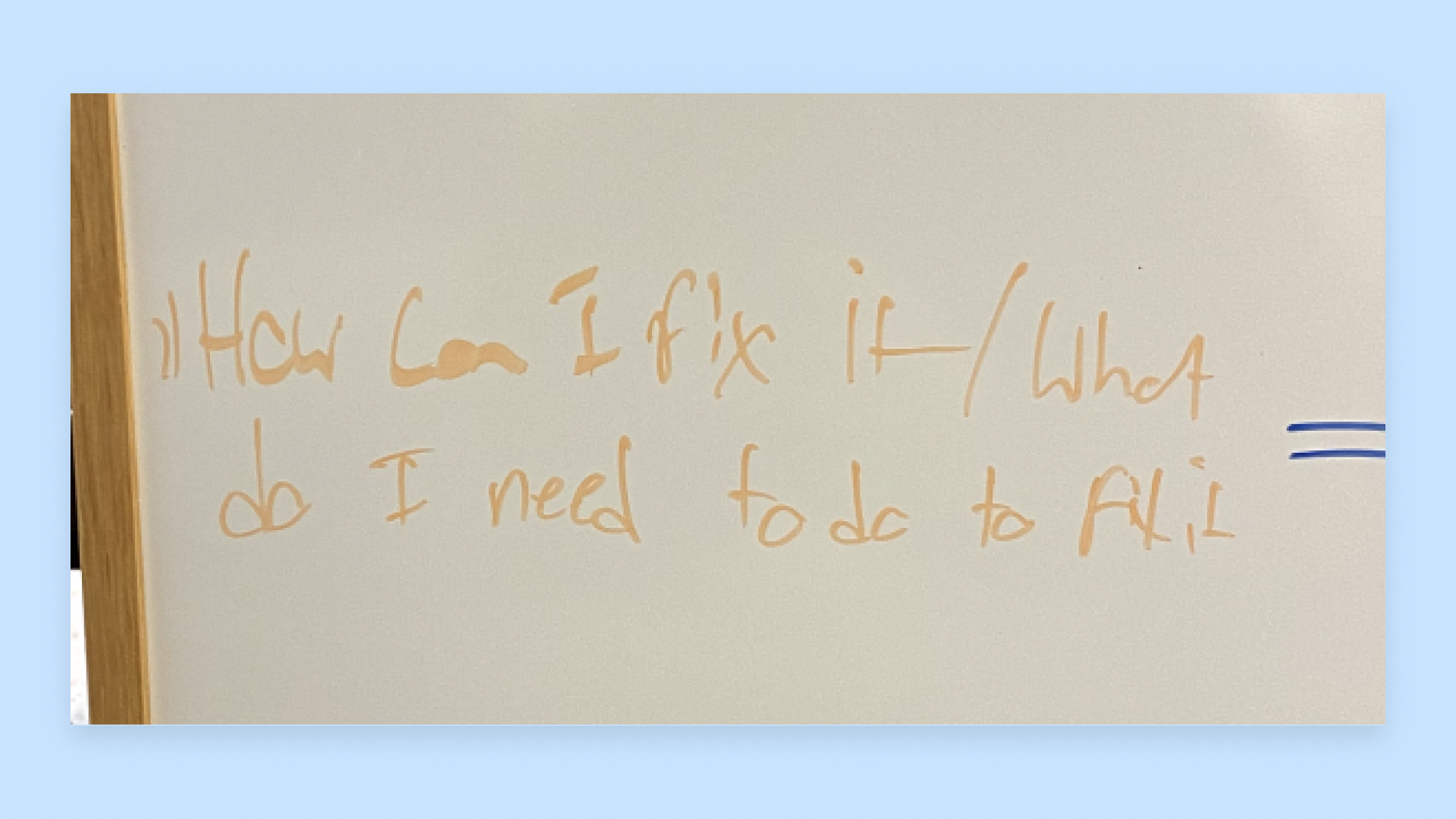
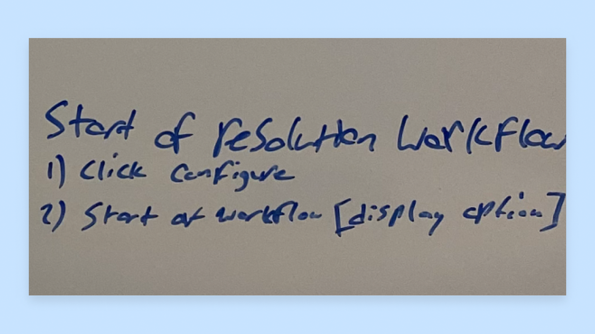
Initial ideas
Exploring the possibilities.
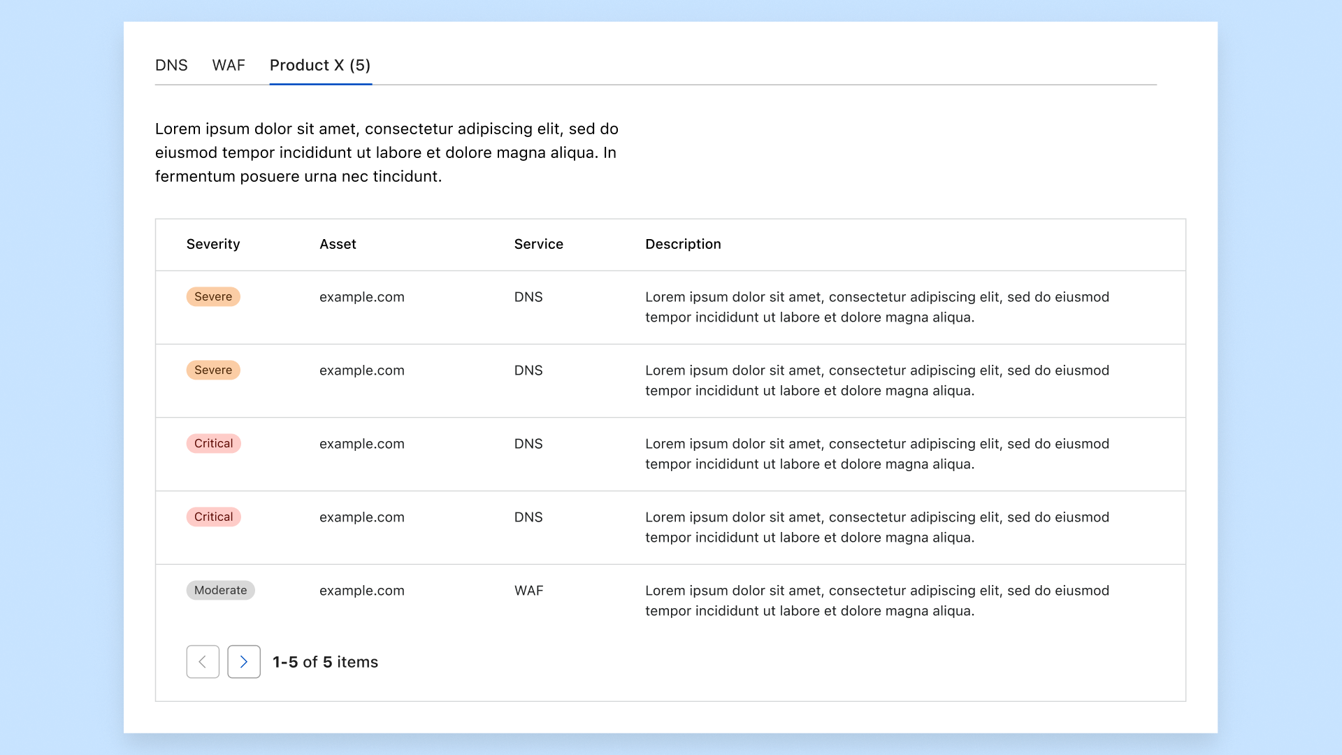
It's critial to display as many of the infractions as possible, but it shouldn't be overwhelming either.
Explored multiple layouts, utilising available vertical and horizontal space.
I had a handful of ideas I wanted to explore, importantly however, each was grounded in my understanding of what customers liked from our existing products, or insights which we gained from previous conversations with customers.
As I developd each idea/concept further, I was cognistent of the position of the feature within the Cloudflare Dashboard UI, which user type is likely to use this feature and how they're different from other types of users of the Dashboard.
The existing structure of the Cloudflare Dashboard mapped to this idea of accounts and zones which accounts were comprised of. The goal of the feature was to position it as a the single place to view the security posture acorss your entire corporation. Therefore, I intentionally placed the entry point of the feature within an account context.
Within a single organisation, there are users from different job functions which use products from Cloudflare. It is unlikely that within a large organsiation, such as those spoken to earlier, a single user is going to be familiar with what each product does and where it can be found within the UI.
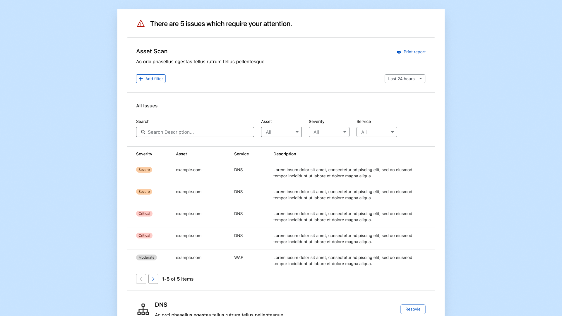
Ultimately, we were building a dashboard highlighting security risks. It had to be clear of distraction, straightforward to navigate and provide the appropriate level of detail to make an informed decision.
The usage cycle
Do the hard work for the customer.
As functionality was expanding across the Dashboard, users would need to know where each feature was located to make any changes.
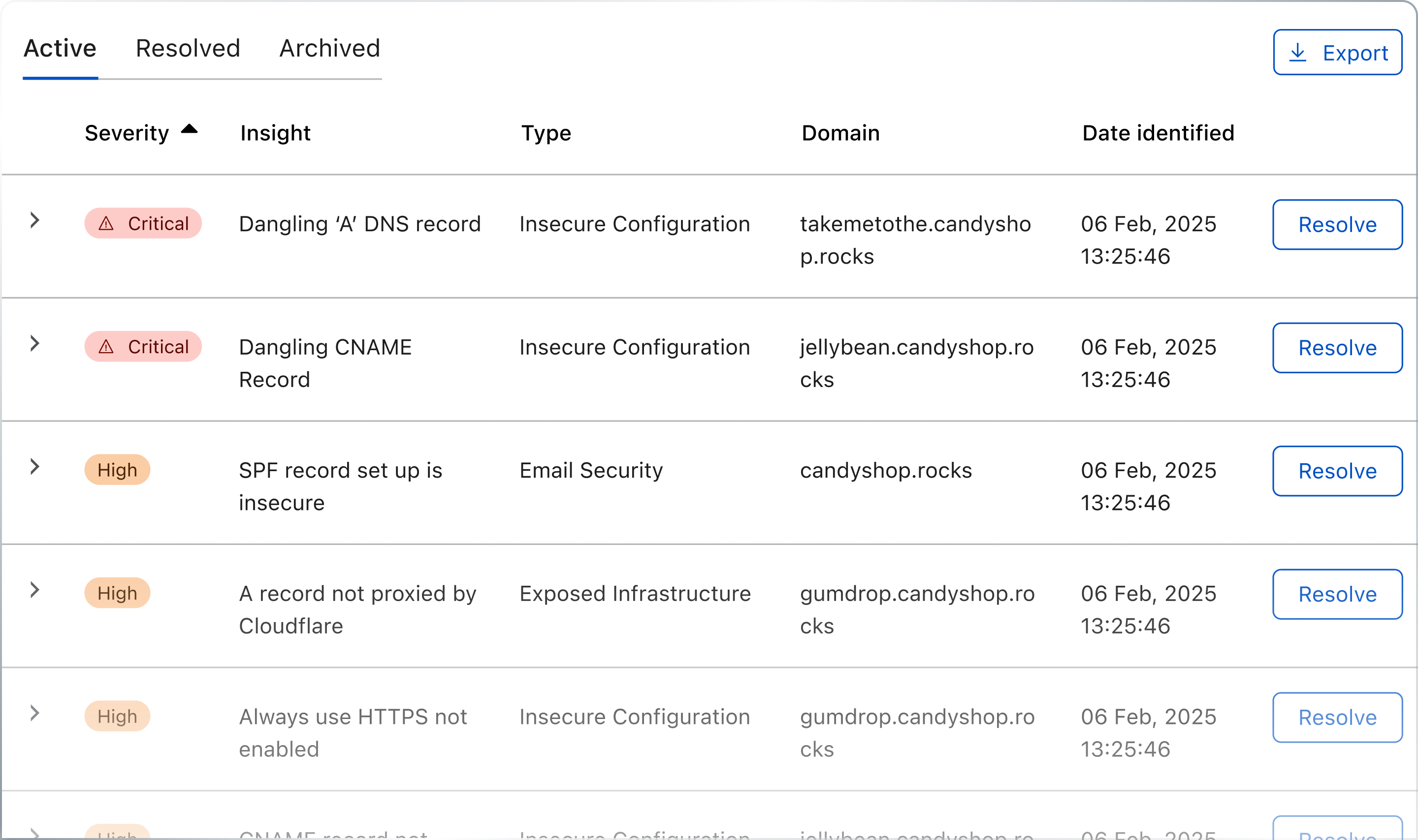
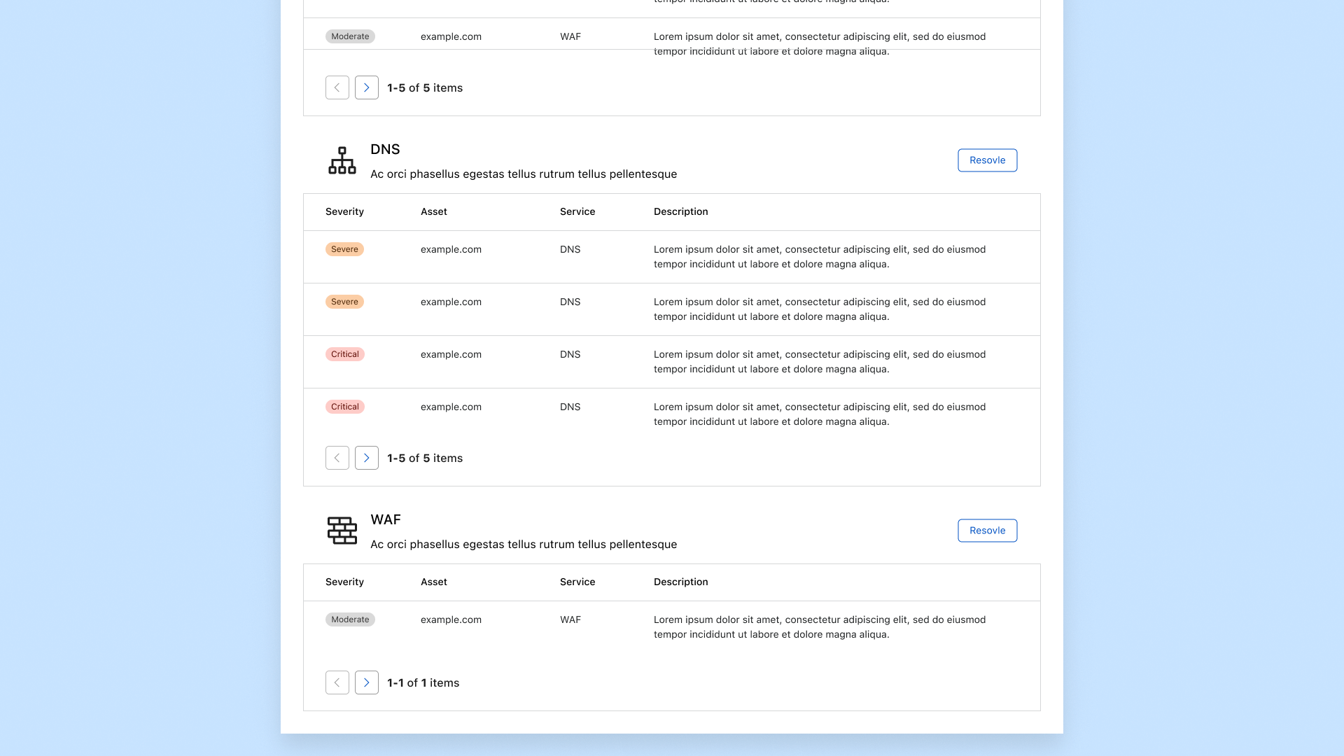
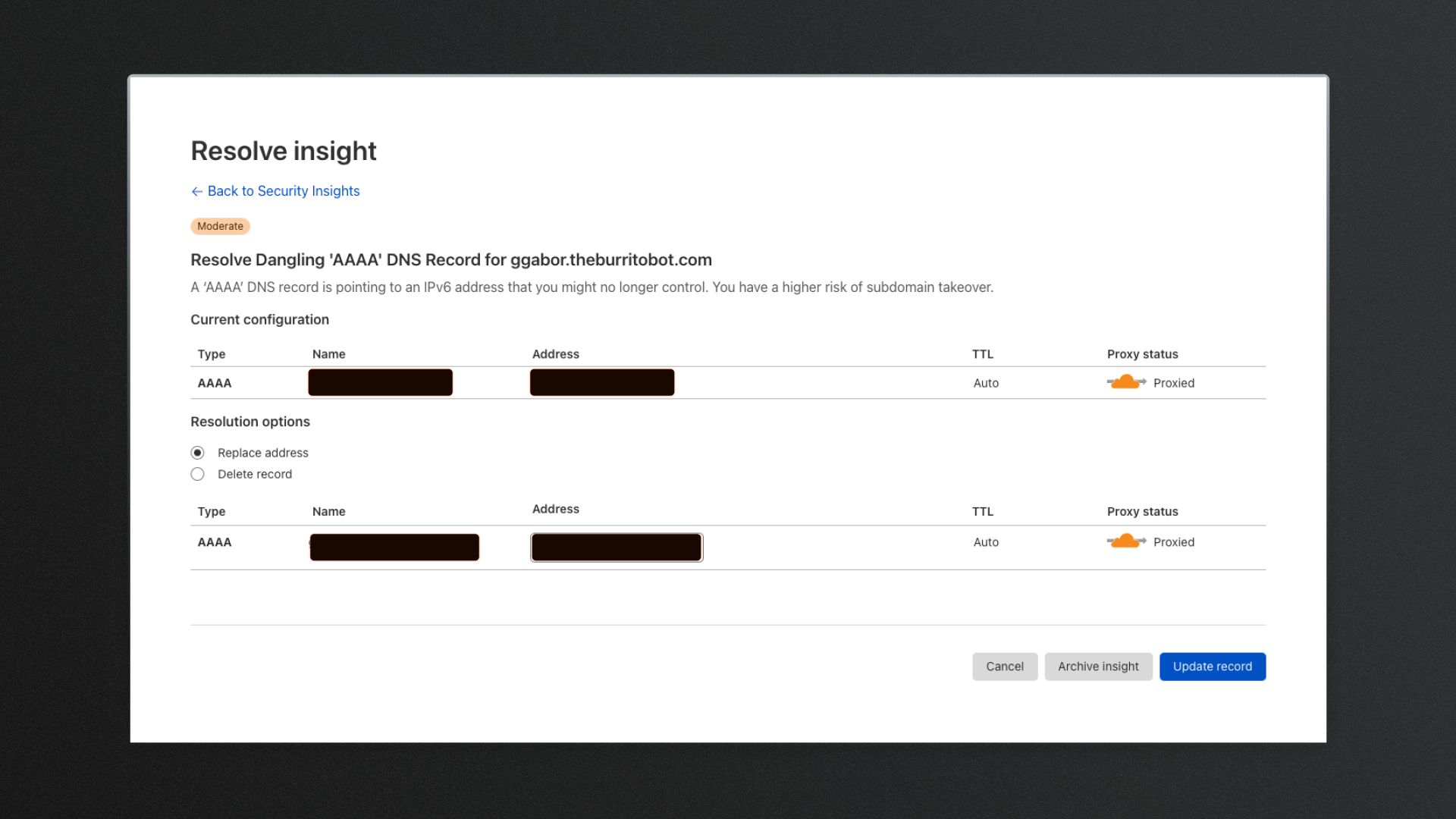
Introduced the ability for the user to address an issue from within the context of the app, without having to navigate across the rest of the Dashboard for the most commonly discovered issues.
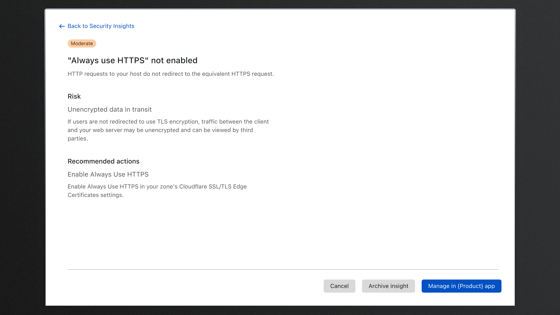
Once security vulnerabilities have been identified, customers naturally wanted to address them as quickly as possible. However, they would only do so if they felt confident in the changes they were about to make. Simply knowning that there's a vulnerability isn't enough. They wanted to know what understand what the effects of that risk were and futher understand how we determined that it was a risk.
Through this understanding, I established that the customer journey is a cycle between: Viewing analytics, understanding the risks and insights, and finally taking a decision to either ignore or quickly mitigate the risk.
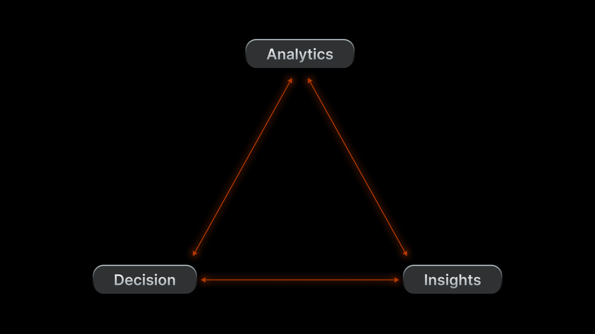
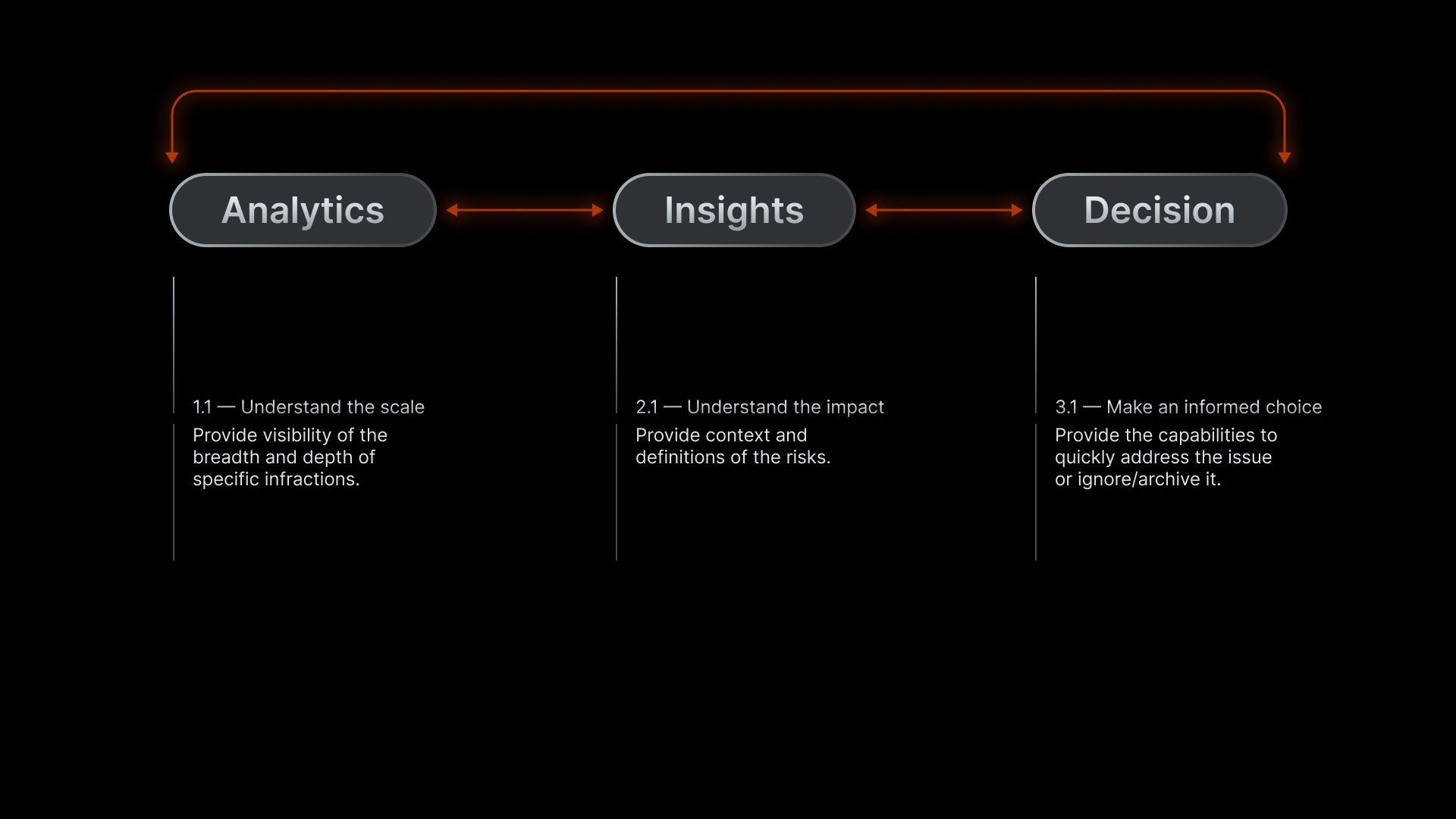
Some users were not familiar navigating through the Cloudflare Dashboard and they wanted a straightforward way of mitigating the risk. Making what's complex, simple, has always been a goal of when whatever feature I'm designing. Where possible, we included a single click, resolution workflow. Here, users would be able to read a summary of the risk and either take action on it, or archive the issue. Alternatively, if we wouldn't manage the issue from this page, we would help the user navigate to the correct page within the dashboard.
Final designs
The one stop shop.
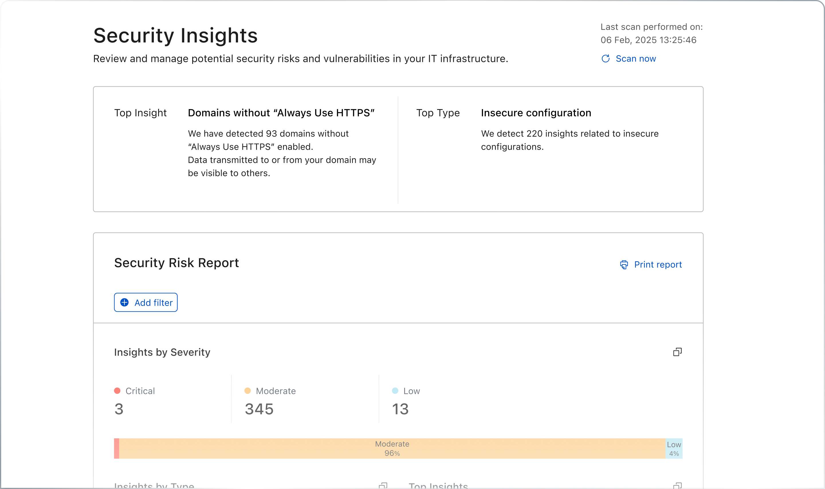
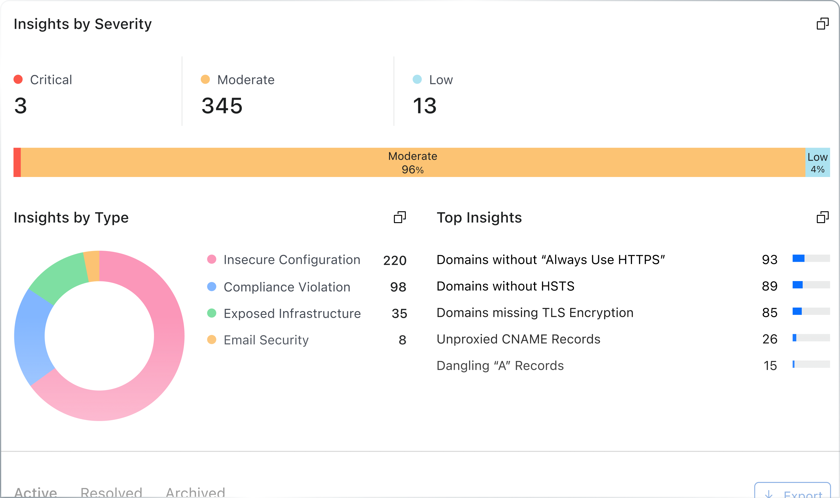
A single page summarising security vulnerabilities discovered across your infrastructure.
