A Quicker and Safer Internet Experience
Overview
Cloudflare WARP · UX Overhaul
Cloudflare WARP is an application available across mobile and desktop. By creating a direct connection to Cloudflare, it provides users with a safer and more secure Internet, and at times, a quicker browsing experience. I was involved with various new features and substantial design updates from 2019 onwards.
Belonging to the Emerging Technologies and Incubation group at Cloudflare, the development process of Radar highly prioritised speed-to-market above all else. This was the definition of a "fast-paced environment" — quickly producing development ready specs, clearly outlining any risks or assumptions, and making UX decisions based off of best practice.
- Android
- iOS
- macOS
- Windows
- Total App Installations: 15+ Million
- Product Manager
- Engineering Manager
- Product Designer x 2
- Platform Engineer
The original 1.1.1.1 mobile app was released in 2018. At the time, the product was very straightforward, a single “connection method” causing all DNS requests from the device to query the Cloudflare 1.1.1.1 DNS service instead of whatever the router had provided. Soon, the app was updated to include further support of the Cloudflare WARP service. Using WARP, not only were DNS requests being sent to Cloudflare, the request would be encrypted, traverse a WireGuard tunnel, eventually terminating within a data center part of the Cloudflare global network amongst 300+ cities.
I began working on the 1.1.1.1/WARP applications from late 2019. During this time I led the design of the macOS and Windows desktop apps, aligned the UI across all 4 platforms and integrated with Cloudflare for Teams — allowing businesses to utilise the WARP applications to enforce web gateway policies and monitor device posture.
In late 2021, I started working with the team again, however this time focussing on the consumer product. We wanted to increase the awareness of the Cloudflare brand to more than just the typical Cloudflare customer up to the point (e.g. Network Engineer, Software Engineer, site owner).
In this article I’ll discuss some of the changes made to the 1.1.1.1 iOS app and why they were made. Towards the end of the article, I have included some of the previous work I completed designing the macOS and Windows apps, during 2020.
Technical jargon → Common sense
Keep the language simple!
Use of unfamiliar, uncommon, and unknown branded terms to describe core functionality.
Conducted surveys trialing different names; concluding by asking users to describe what they thought each mode did to confirm they understood.
It became clear that users were unsure what the difference was between each of the connection modes — I couldn’t blame them either, the connection modes were branded “1.1.1.1” and “WARP”, and we didn’t make it obvious what the purpose of either was or what value each offered. Users being unable to understand what the connection modes meant was also a direct contradiction to our goal of surfacing the benefits of the app to users.
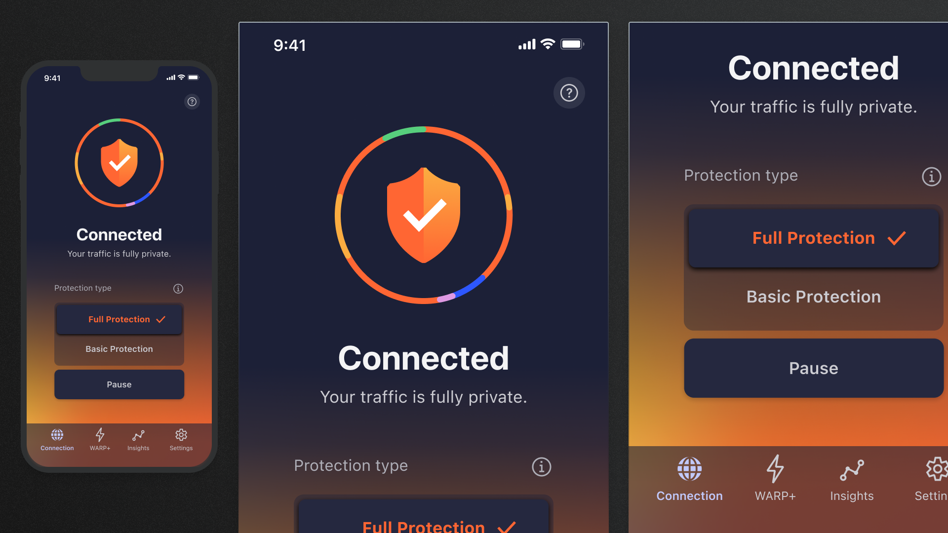
Selecting the appropriate connection mode was a key interaction within the user journey. Simply put, a user wanted to know which mode they’re currently using, which mode they should use and how to pause the service altogether.
I boiled down each of the connection modes to their simplest definitions.
- 1.1.1.1 — DNS requests were protected from snooping by third-parties
- WARP — Not only limited to DNS, but the origin is unable to see the true source IP
These definitions are too technical for many people to understand but, importantly, it’s possible to reduce their complexity. Realising that the functionality of 1.1.1.1 is a subset of the functionality of WARP, it began to shift in my mind from an independent feature to a partial implementation of WARP. Otherwise also referred to as a “basic” version of WARP. It was this shift in thinking which led us to refer to 1.1.1.1 as “Basic protection” and WARP as “Full protection”. As a product, our goal was to keep users as secure for as many cases as possible. That said, due to how the technology works, sometimes connections could be interpreted. It was crucial that a path was provided for users to still remain relatively secure even during this case. The difference in language between “Basic” and “Full” provided the perfect balance, encouraging users to use the most secure option, but still being able to use 1.1.1.1 or “Basic Protection” whenever they encountered issues with WARP or “Full Protection” rather than completing disconnecting altogether.
Design iterations
Draw out all the ideas…
Our goal is to keep the user as secure as possible, under as many circumstances as possible. However, at times due to the technology, it be be necessary for the user to have to change their connection mode.
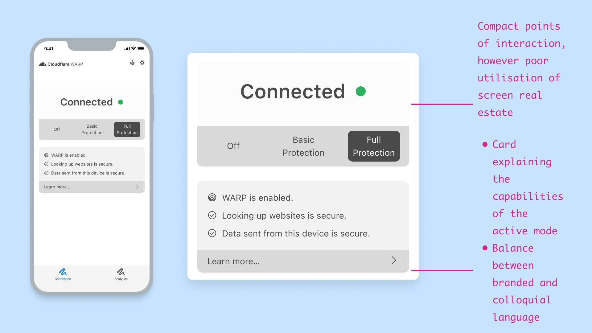
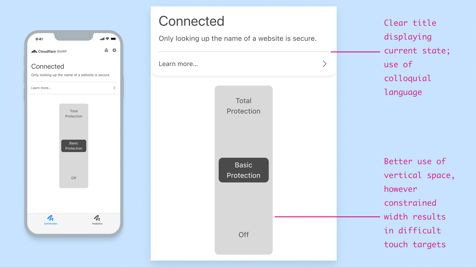
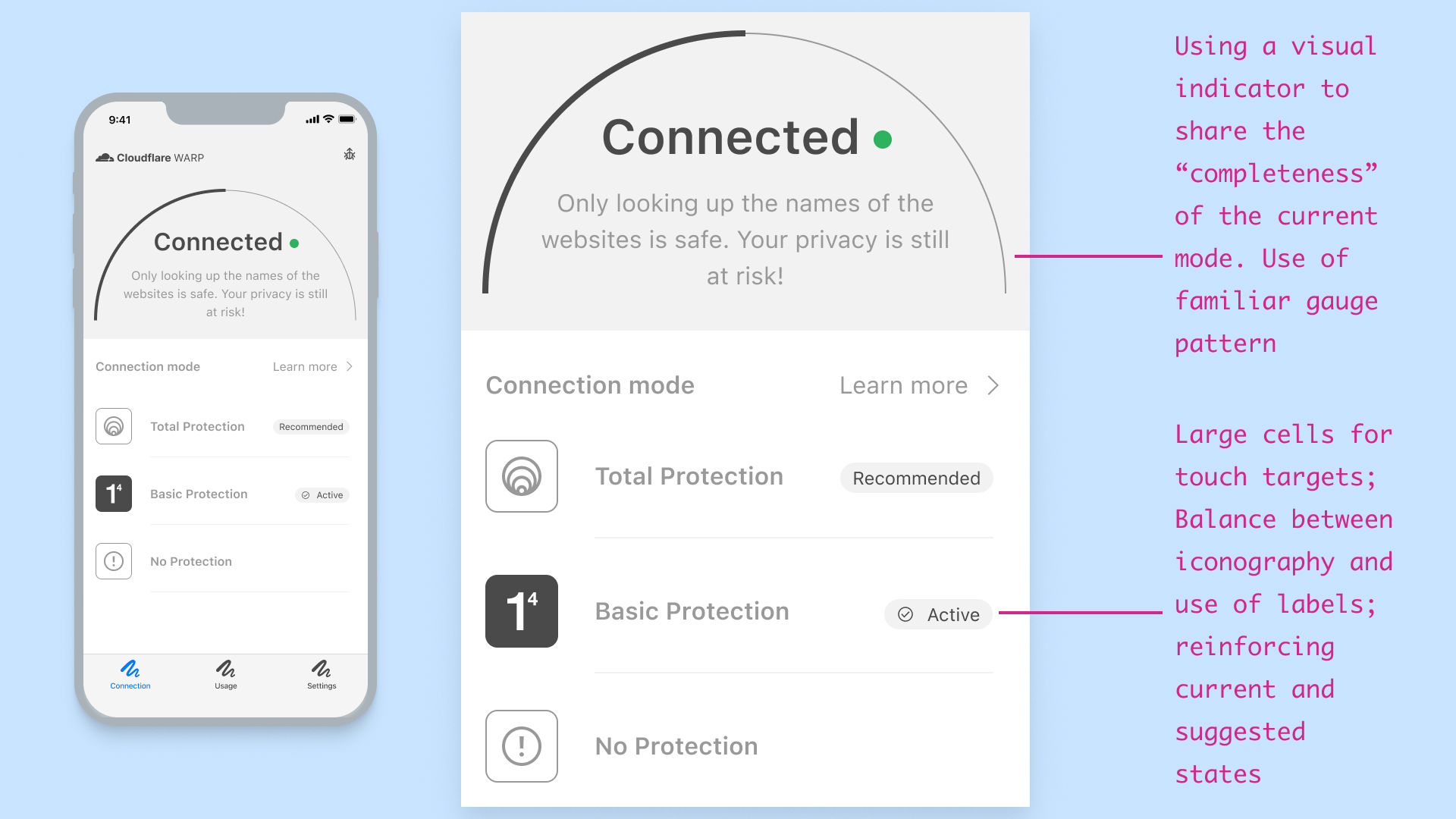
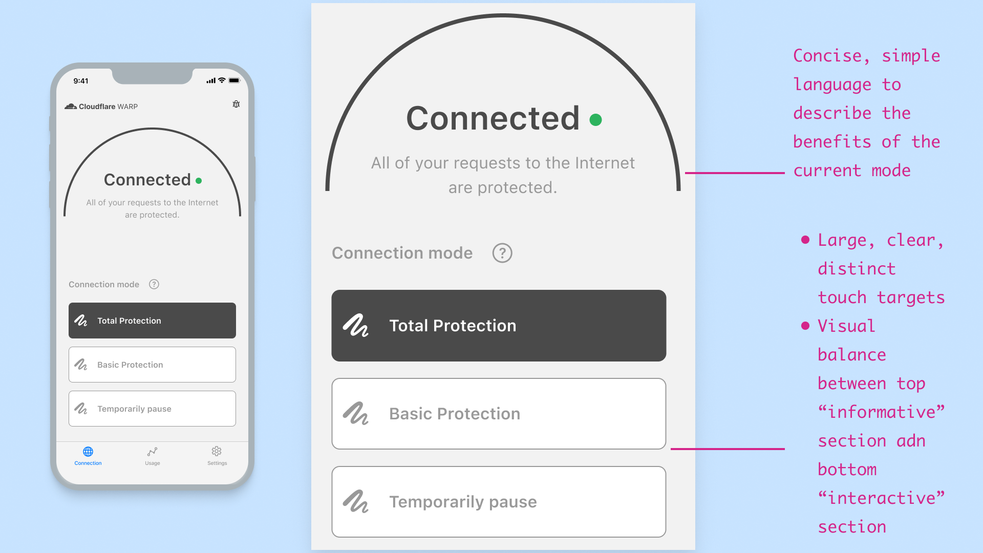
How can we let the user quickly and simply change their connection mode while not distrupting their flow and communicate which level of secuirty they're using.
Produced multiple UI variations, exploring differnet interactions, and detail of content. Ultimately narrowing down the explorations by discussing with development team and feedback from usability tests.
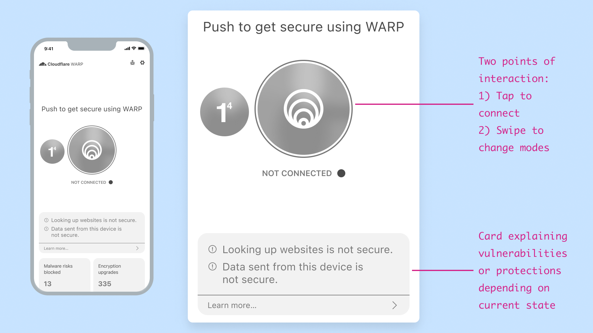
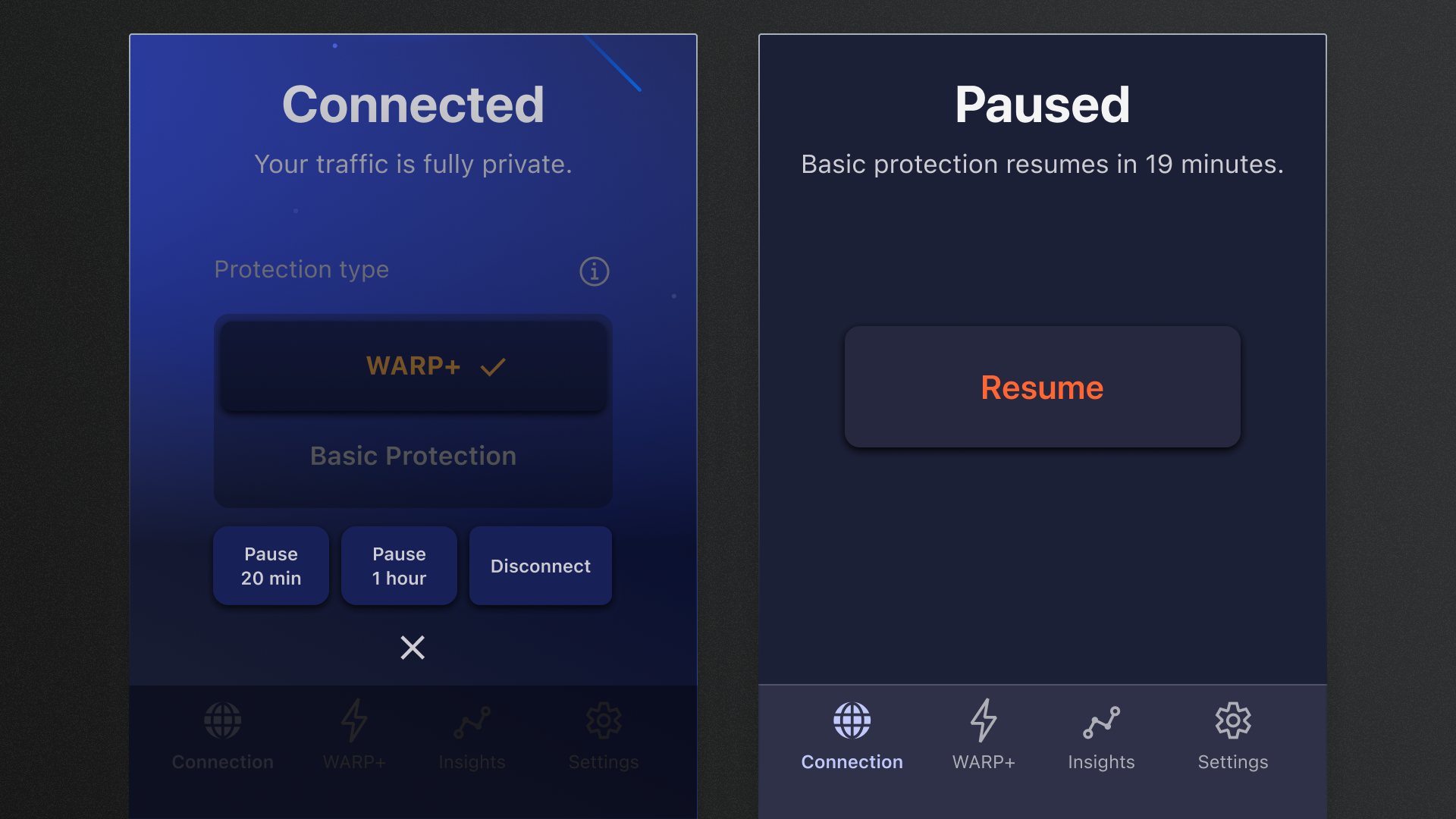
From the initial release of the app in 2018, it featured a large prominent switch to control the state of the connection. As more features were added however, the switch started to lose its simplicity. Particularly, after the introduction of the “pause connection” feature; rather than completely disconnecting, now when a user taps on the switch, an action sheet would be presented. What was previously a single tap to disconnect, now became a tap followed up by a decision, and finally another tap.
With some of these complexities now apparent, during the design phase of the connection screen, I had the following goals:
- Make it clear which connectivity method was currently active
- Provide an easy way to select between multiple connectivity methods
- Avoid introducing any expected menus when interacting with UI components
Lastly, although not a specific design goal, I wanted to use this opportunity to explore some alternative, perhaps unique interactions.
Validating through usability testing
Seek feedback, early and often.
There wasn't an established process to speak with consumer users of the existing app.
Receiving support from User Research was challenging due to their limited availability.
Using tools such as Google Forms and Maze, produced surveys and interactive prototypes, to ensure that users understood the changes we had made and further observe their usage of the app.
This release of the app was intended to address some of the issues which had been identified since the earlier versions. Unlike the development cycles previously, this time we had the opportunity to seek validation and feedback from current and potential users.
Using a combination of Google Forms and Maze, the various concepts of the connection screen were shared. The users were tasked to complete tasks involving changing connection modes and asking how they would learn more about a specific connection mode.
Final designs
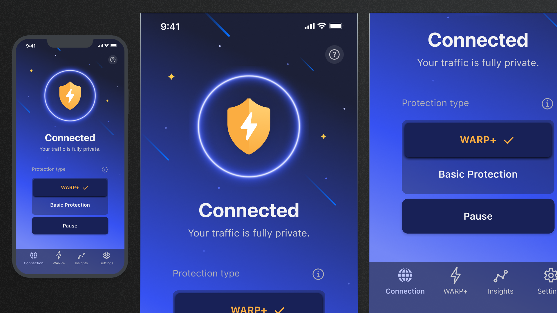
Straightforward and obvious.
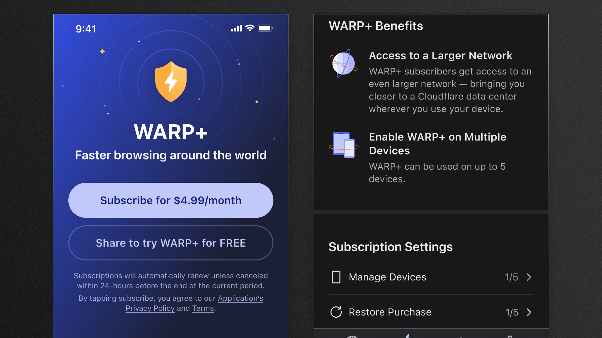
Users are now able to better understand which connection mode they're using, quickly change modes or pause the connection if needed, and access insights of their usage to visualise the value of the app.
Sprinkles of delight
Make it joyful.
Lacking in any moments of surprise and delight, the apps risked coming across as too utilitarian and without users having any positive associations with the Cloudflare brand.
Using a combination of Figma and After Effects, I created a prototype of an animation which was later completed by the Brand Design Team.
The WARP app at the surface is a utility. It provides a safer, more secure Internet experience. An additional benefit however may also be an increase to the perceived browsing speed, although this isn't the primary focus of the app or always guaranteed.
The existing branding of the app was influenced by outer space, primarily including stars, comets, etc. With this next iteration, this theme continued, and was further associated with the “WARP” mode specifically.
For users who successfully subscribed to the premium service, WARP+ (providing unlimited monthly usage), I wanted them to feel a sense of excitement upon completing the transaction. With the space concept in mind, I explored a warp speed concept. I prototyped this using Figma and After Effects.
Windows and macOS apps
All platforms covered.
The business wanted to quickly produce a desktop experience of the WARP apps in order to set the foundations for future Enterprise product offerings utilising the capabilities of the exising apps.
There was little time to reimagine an experience specifically for desktop.
Provided designs for the macOS and Windows apps, adhering to platform norms when possible, while retaining key elements from the mobile experience to provide familiarity for users already using the mobile apps.
As a stepping stone for other products that were to be built on top of the existing 1.1.1.1 services, the team wanted to make the apps available across native desktop (Windows and macOS) as well.
We made a few assumptions about the user that we took into consideration during the designing and development of the desktop apps:
- The user is likely to be more technically proficient than the mobile user
- The user is likely to already be using the existing mobile app
- The overall user base would be smaller than mobile
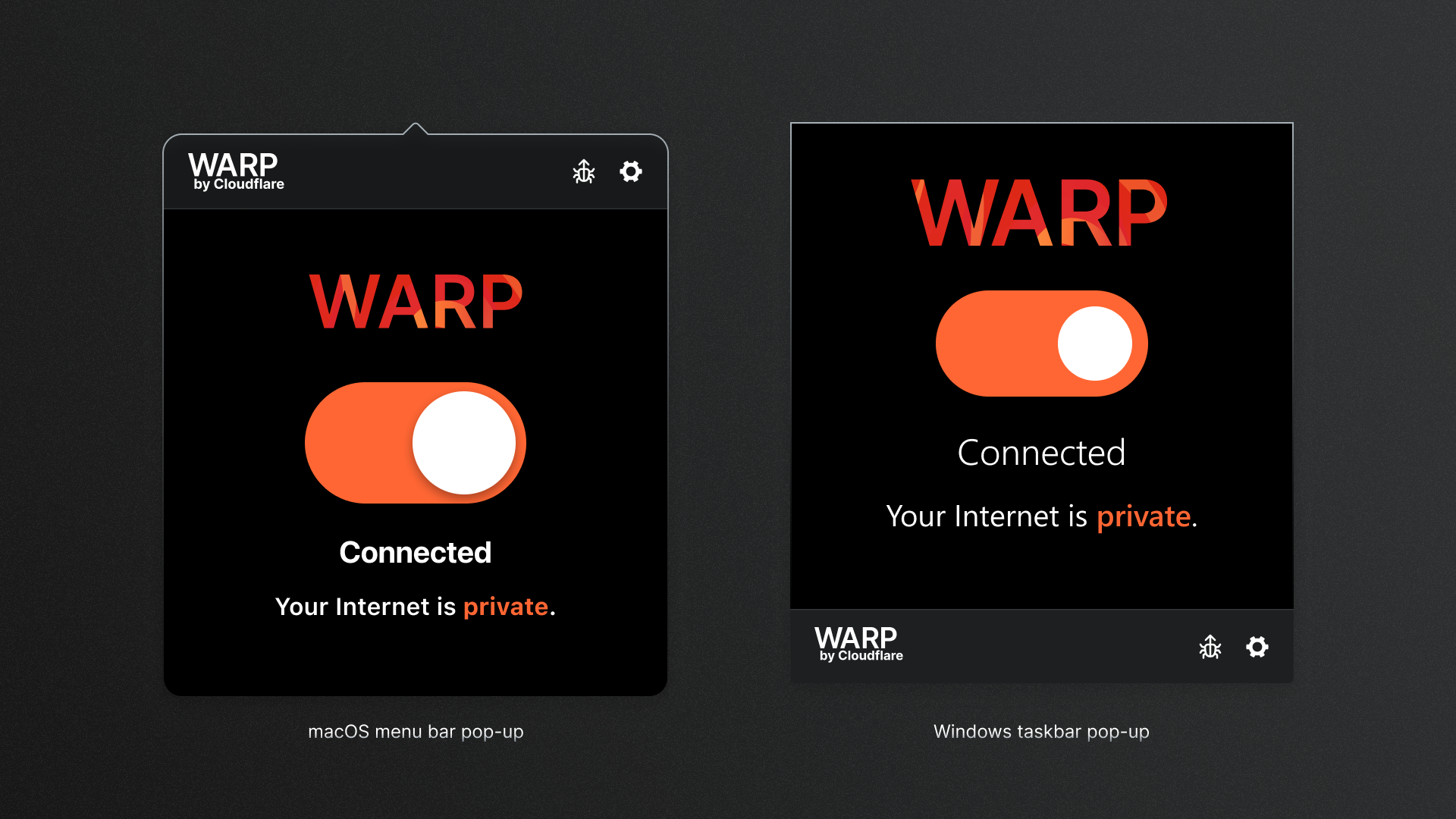
With these assumptions in mind, a goal of mine was to keep any new interactions to a minimum while still adhering to traditional desktop app conventions. Therefore the desktop apps maintain the large switch concept found in the mobile apps.
Naturally, users would become frustrated when they experienced connectivity issues, so making sure they had to do as little work as necessary to continue with their tasks was top of mind when designing the desktop apps. Therefore placing it within the menu bar (macOS) and taskbar (Windows) made the most sense to make it easily accessible for the user.
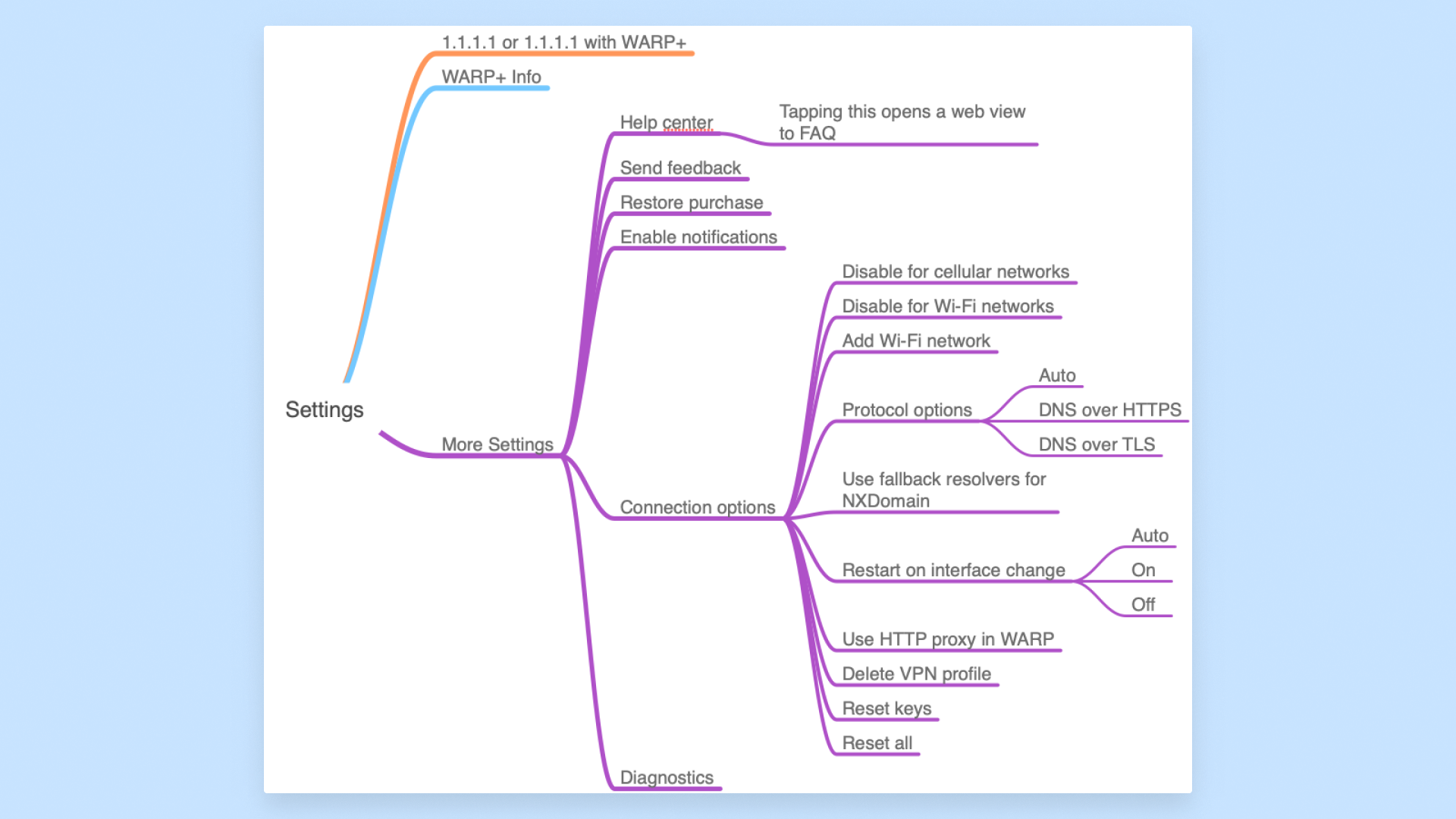
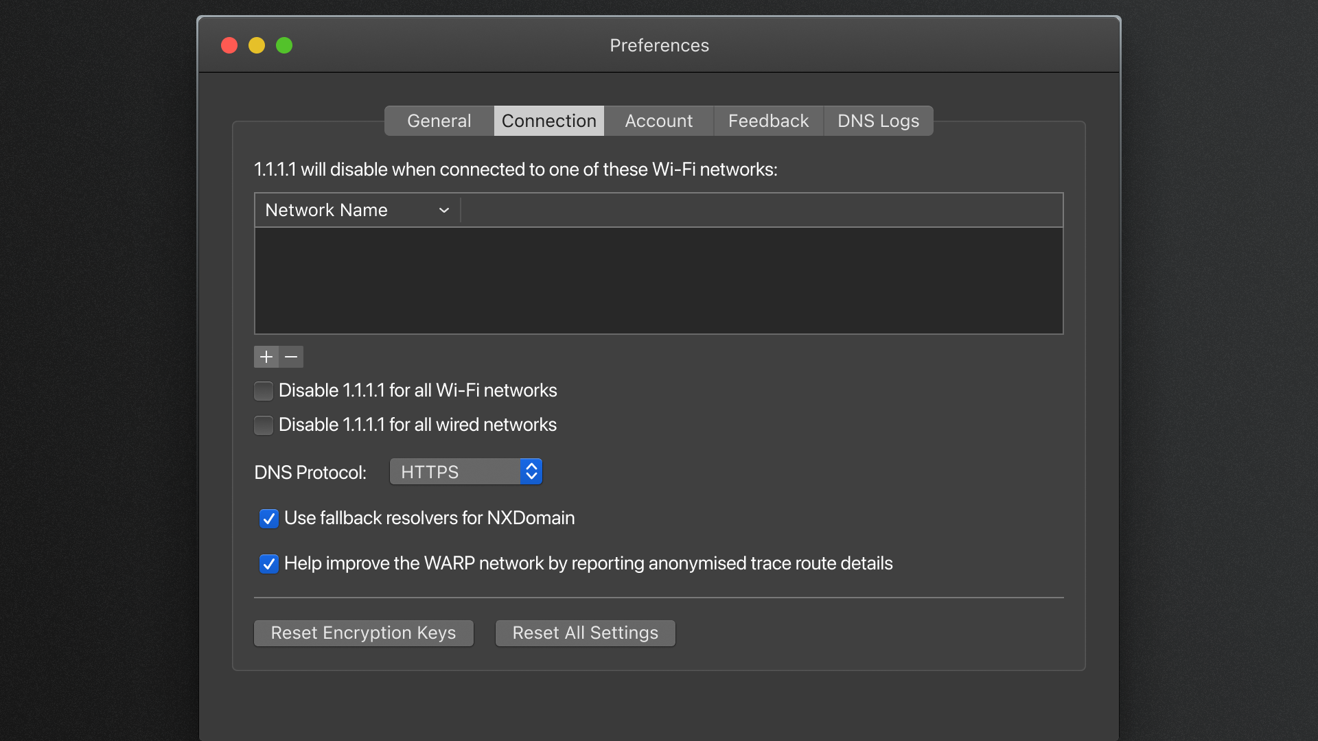
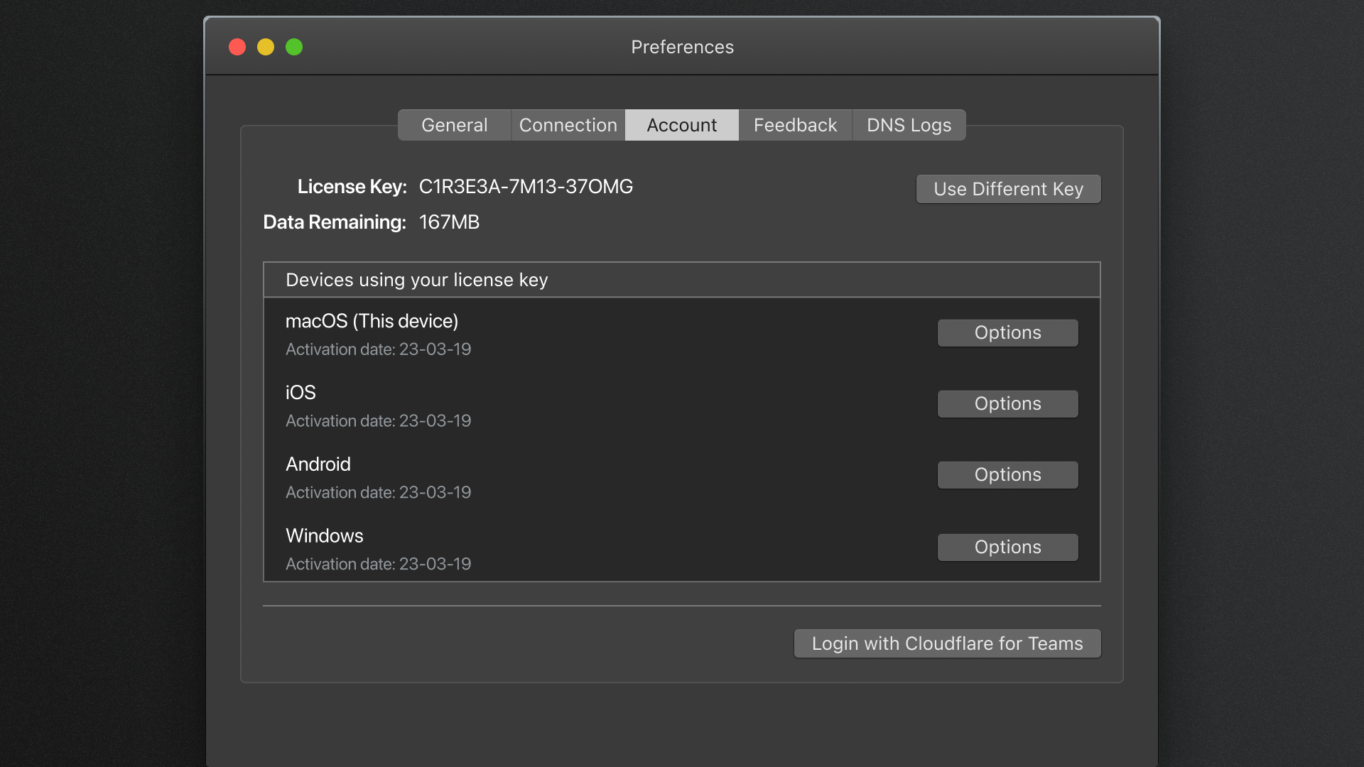
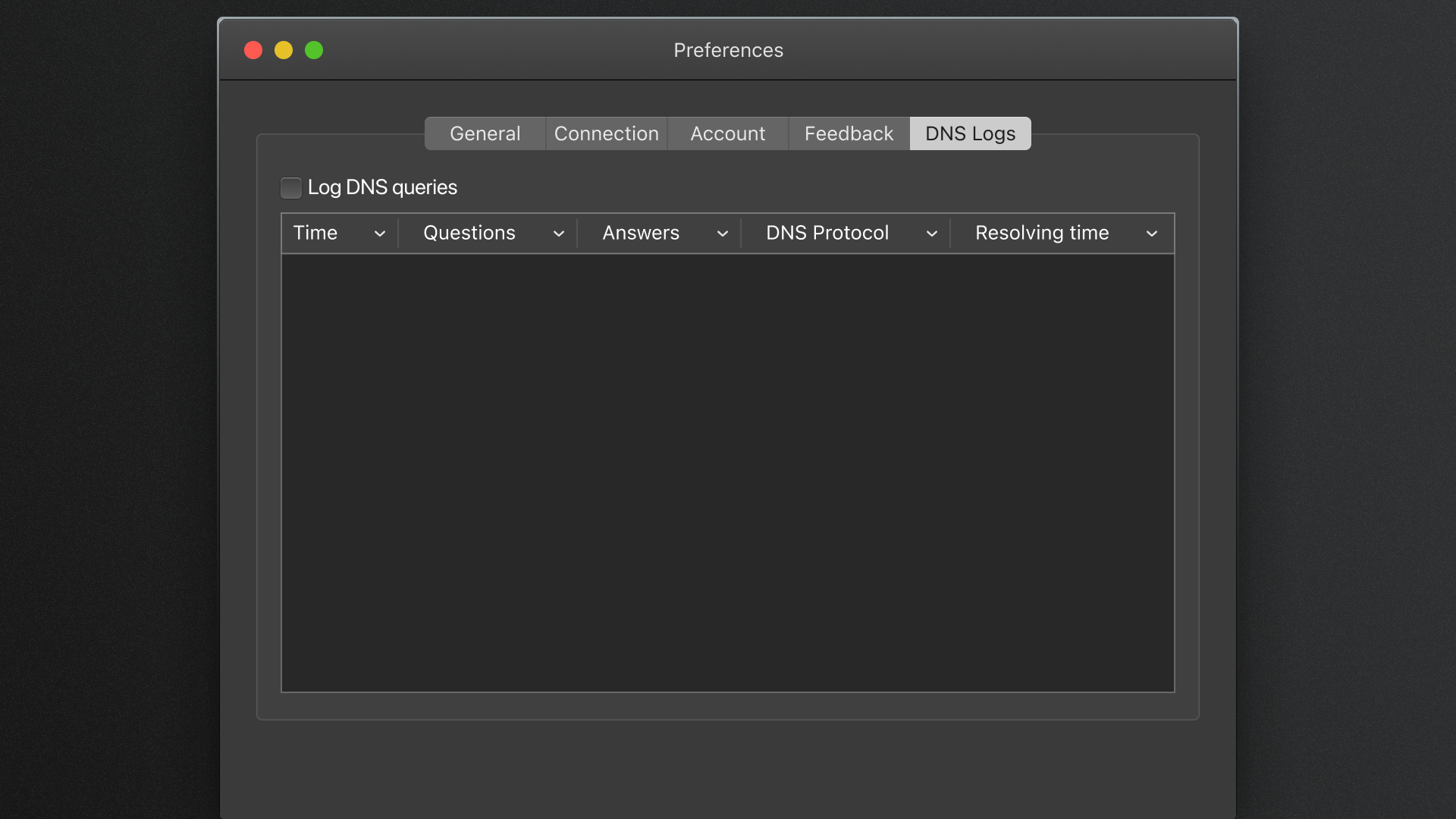
The WARP app has many configurable options. It was important to present the most relevant information, within the appropriate context to the user, in such a way that they wouldn’t misconfigure themselves into an unstable state.
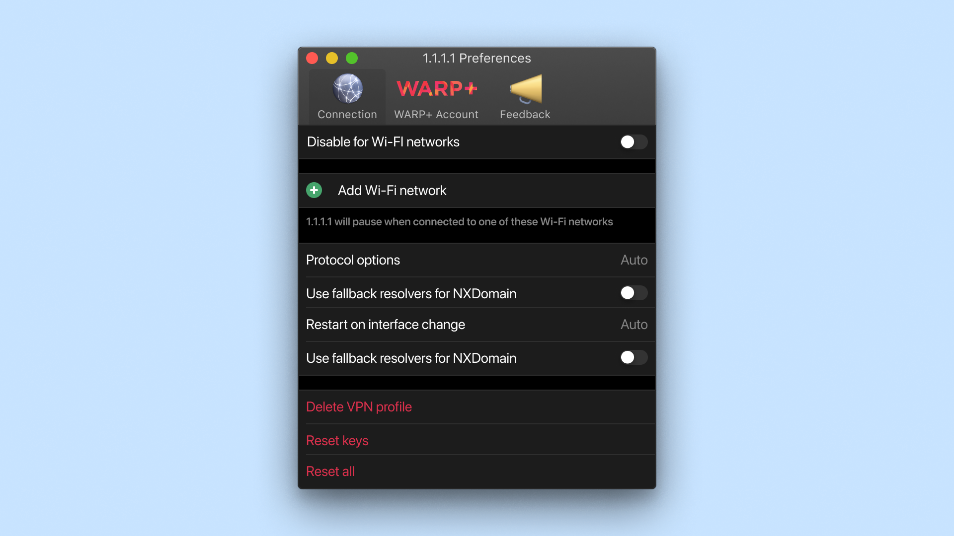
Initially I explored reusing the patterns we already established on the mobile apps. As the business wanted development to be as lean as possible, this would allow us to quickly build this portion of the app. However, it quickly became clear that presenting it like this for desktop felt contrived and wasn’t ideal. Doing so, the additional screen real estate offered by desktops would also be missed out.
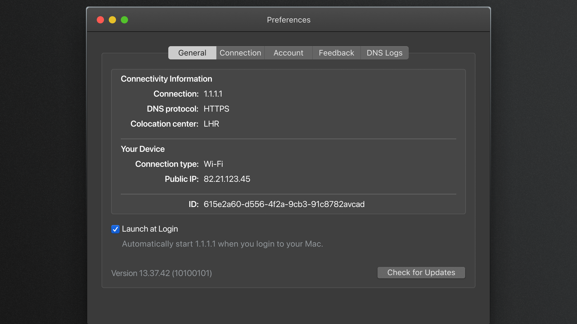
As one of the design goals was to maintain and adhere to platform norms, I opted for displaying the apps preferences using the traditional system panels. Throughout the design iterations, I referenced the macOS System Preferences application. As this is a common series of menus and dialogs that a user would have likely used in the past, I was confident users would understand how to navigate and interact with the various UI components shown. Doing so, during development, interactions associated with increasing the accessibility of the app would already be included as default.
Integration of Cloudflare Zero Trust
Expanding to Enterprise.
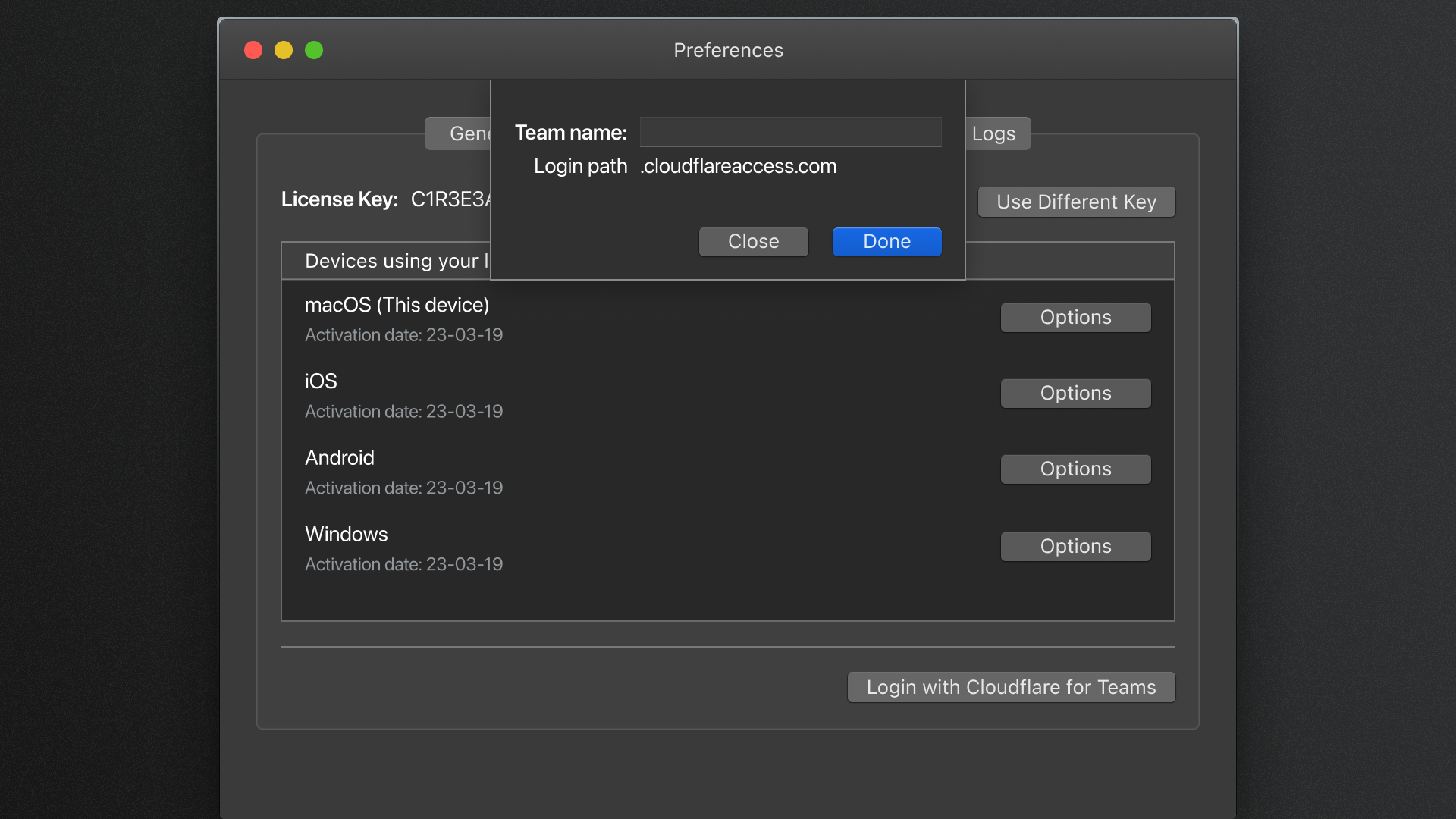
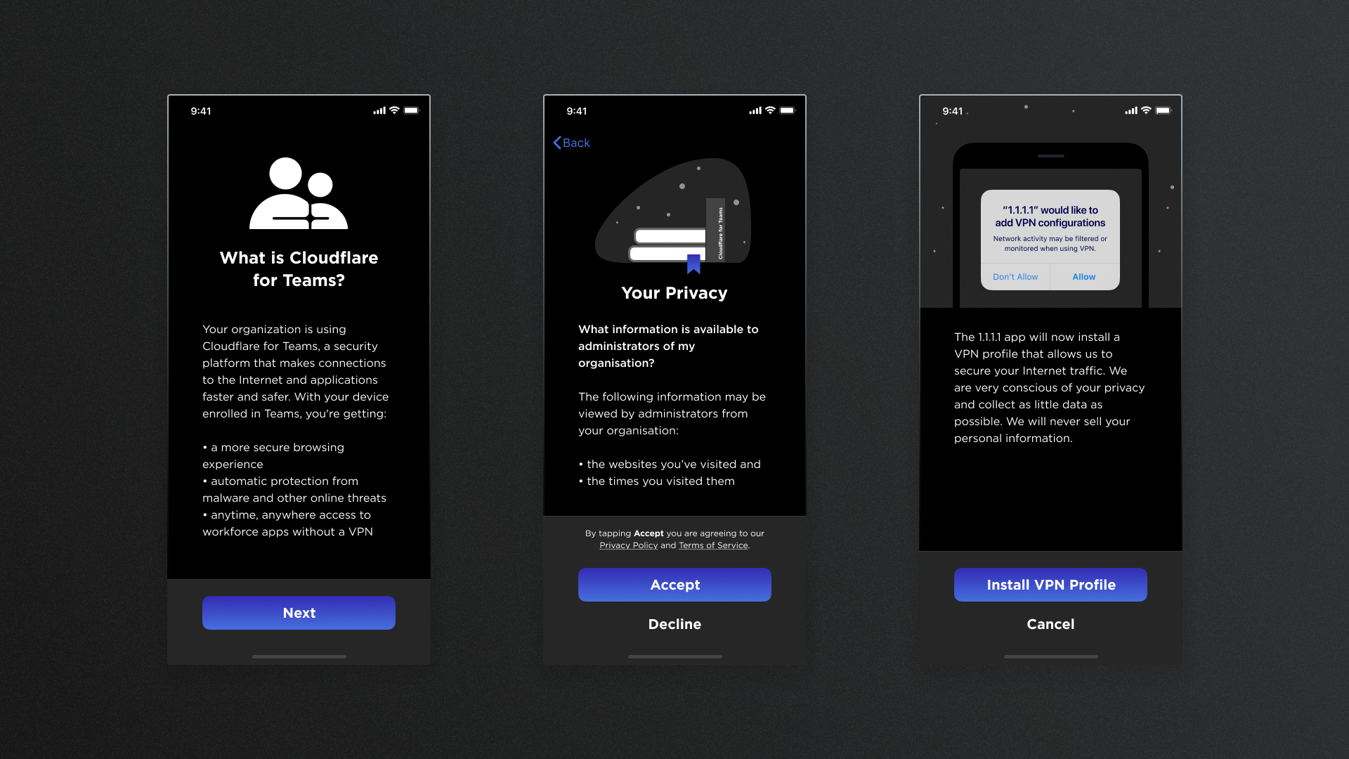
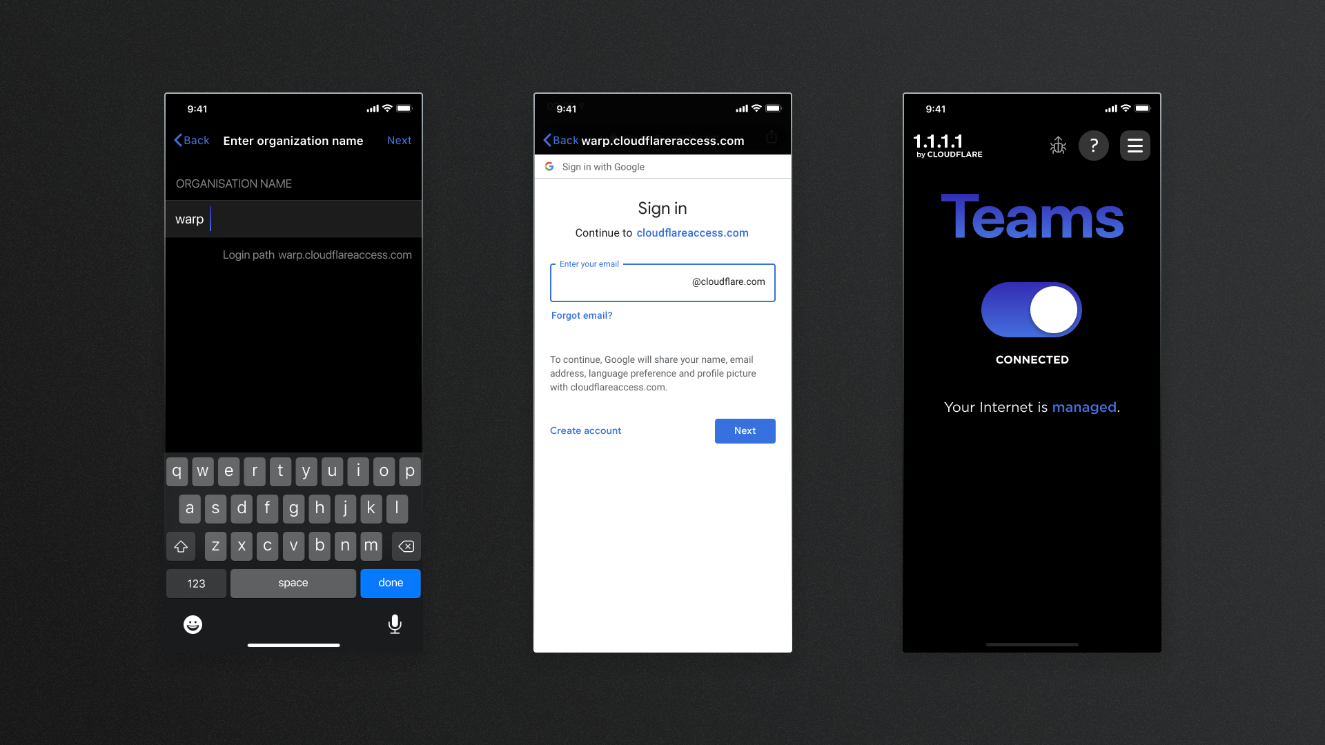
The Enterprise offering required specific details from the user, unlike the traditional consumer application.
Integrated the required fields for an Enterprise user to successfully login, whilst reducing the number of unique/brand new interactions necessary.
As of 2020, with the introduction of the Cloudflare Zero Trust product suite, the WARP apps served two unique customer types:
- Consumers
- Enterprise employees
In an effort to reduce the development time required to release client applications specific for Zero Trust customers, the decision was made to be able to allow Zero Trust customers to sign in from the existing WARP apps. In order to make ourselves able to market this capability as soon as possible, the design changes were aimed to be at a minimum while still allowing for the necessary Zero Trust customer requirements.
As WARP+ was an existing feature, which allows users to use WARP across multiple devices, I opted to add the Zero Trust entry point on the Account screen.
